
The audience research is a task where a member of the group has to put together a number of surveys in order to get advice on our final products from out audience.
Following the survey the results a neatly presented in a visual presentation which benefits the group and lets our respondents know we understand their demands. In order to start this survey we had to find out the range of social media we should use to highlight the different ways we communicated with the audience. This list is shown bellow:
Following the survey the results a neatly presented in a visual presentation which benefits the group and lets our respondents know we understand their demands. In order to start this survey we had to find out the range of social media we should use to highlight the different ways we communicated with the audience. This list is shown bellow:

|

|

|

|

|
For this section we asked our target audience 10 questions in terms of what they would like to be featured on our magazine front cover. We suggested that it would be a good idea not only look at well known professional magazine front covers but also in the list of our options to at least feature something originally made from us i.e. uncommon colour scheme. The following questions in this section include colour scheme, typography, layout, coverlines and possible image that would be our main image:
1. What is your most ideal colour scheme?
A. Green, Yellow and White
|

B. Green, Yellow and Red
|
C. Green, Yellow and Blue
|
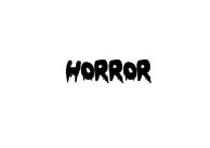
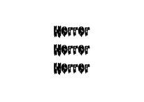
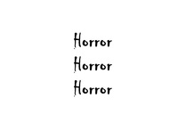
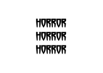
2. What Font Style do your prefer to see as the title
Option 1
|
Option 2
|

Option 3
|

Option 4
|
3. What Font Style would you prefer to see as the other written text?

Option 1
|
Option 2
|
Option 3
|
Option 4
|
4. What is your favorite layout listed bellow

Layout 1
|

Layout 2
|

Layout 3
|

Layout 4
|
5. Who/ and what would you like to see on the front page?
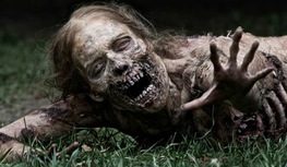
A. One zombie
|

B. A group of zombies
|

C. Zombies chasing the protagonist/s
|
6. What camera shot do you think is best for the model on the magazine?

A.Close -Up
|

B. Medium Close -Up
|

C. Long shot
|
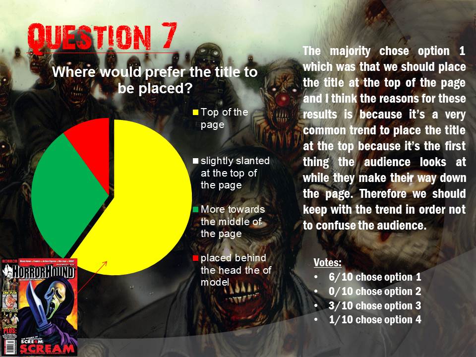
7. Where would you prefer the title to be placed?

A. Top of the page
|
B. slightly slanted at the top of the page
|
C. More towards the middle of the page
|
D. placed behind the head the of model
|
8. How many coverlines should there be?

|

|

|
9. What price do you think is reasonable for the magazine?
A - £1.50
B - £2.50
C.-£3.00
B - £2.50
C.-£3.00
10. Should there be other images featured on the front page?
A- yes
B- No
B- No
Evidence:
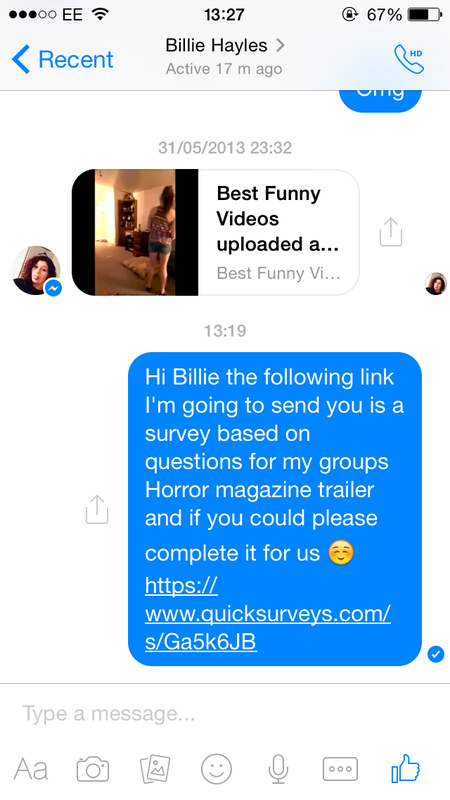
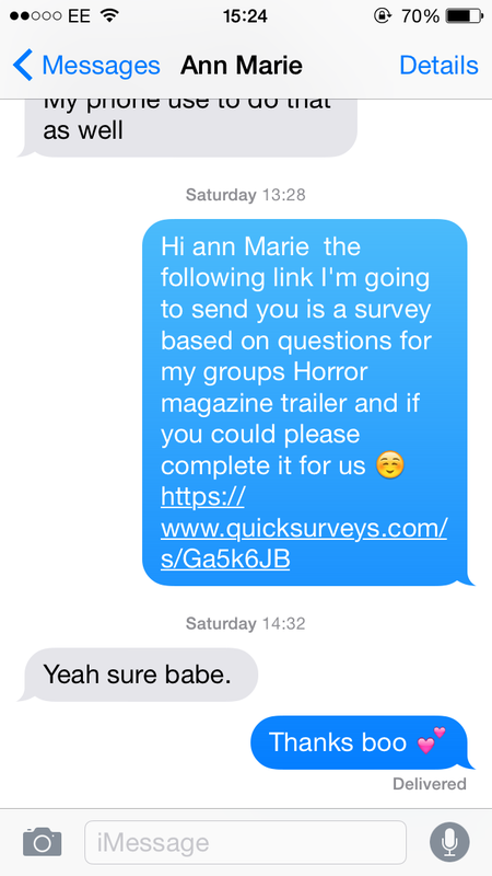
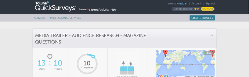
To conduct the survey we used the website quicksurvey.com which allowed us to place visual images alongside our options to give to the audience. Once the survey was launched we were able to copy a link and send it via social media. I also got to sit down with another media student and ask them questions from our magazine survey. Bellow shows screen shots of conversations from Twiter, Facebook and whatsapp with some of our respondents:
|
|
|

|

|
|
|
Results:


Conclusion
|
There was a mixture of people who don't just study media and for this reason the results shows a range of different requests which represents the idea of how important it is to stay creative when moving onto the production stage. I believe the mixture of standard and visual questions including multiple choices helped our respondents a lot on what they felt was right to chose which hopefully created a picture of what they think our end product will be which has been very useful for the group. The following features that were suggested are: (1) Yellow/Green/Blue is the colour proposed by our audience, (2) 'crime times six' should be the typography used for our magazine title , (3) '28 days later' should be the typography for our other written text , (4) layout 4 should be the bases of our template, (5) our group has the choice to between option 1 and 3, (6) the image should be a long shot, (7) the title should be at the top of the page ,(8) there should be 4 coverlines (9) the price of the magazine should be £2.50, (10)lastly we shouldn't include any other images.
|

|
For this section we asked our target audience 10 questions in terms of what they would like to be featured on our poster as well as how they would like it to be displayed.The following questions include colour scheme, typography, layout and camera shots/angles etc.
1. What is your most preferred colour scheme

Green, Yellow and Red
|

Green, Yellow and Orange
|

Green, Yellow and White
|
2. What is your Most Preferred Layout?

Layout 1
|
Layout 2
|

Layout 3
|
3. What Font choice would your prefer for our typography

Option 1
|

Option 2
|

Option 3
|
4 Who and what would you like to see on our poster?
A. The entire stock character cast
B. The protagonist
C. The anatagonist
5. What camera should our image be?
Close- Up
|

Mid- Shot
|

Long Shot
|
6. If decided the that subject on the Poster should be holding a prop what would you like it to be?

A knife
|
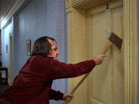
An axe
|

I wouldn't like a prop to be featured
|
7. Where would you prefer the tagline to be laid out?

A. Under the title
|

B. At the top of the page
|

C. On top of the credits
|
8. Would you like to see the credits on our poster (Directors name etc)
A. Yes
B.No
9. What background suits our synopsis better? (pick 2 out of the 4)

A. A old building
|

B. A camp site
|

C. A street
|

D. A plain background
|
10. What camera angle would you like the main shot to be taken at?

A. Canted angle
|

B. Low angle
|

C. High angle
|
Evidence:
To conduct the survey we used the website quicksurvey.com which allowed us to place visual images alongside our options to give to the audience. Once the survey was launched we were able to copy a link and send it via social media. I also got to sit down with another media student and ask them questions from our magazine survey. Bellow shows screen shots of conversations from Snapchat with some of our respondents:

|

|
|

|

|

|
|
Results:


Conclusion
|
To conclude the information gathered from our poster survey has helped the group understand what is expected of us which is to meet our audiences suggestions which was : (1) Yellow, Green and Red should be the running theme colours, (2) Layout 3 should be the template for our poster, (3) option A should be our typography for the poster (4) their was a tie between using option 1 and 3 for poster therefore its our decision to decide whats best (5) the image should be a mid-shot (6) an axe should be featured as a prop (7) the tagline should be placed at the top of the poster (8) credits should be featured on the poster (9) there was a tie in votes between the background image either featuring a old building or an abandoned street (10) lastly the camera angle of the image should be a low angle. Therefore its important to follow this in order for our final products to look appealing and to be at high standard of quality work. We've made sure that we've asked people from our target audience (17+), thus the results stay relevant to our concept and treatment.
|

|
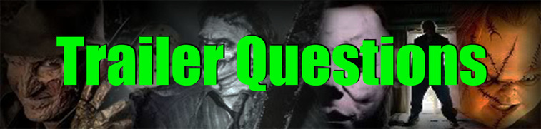
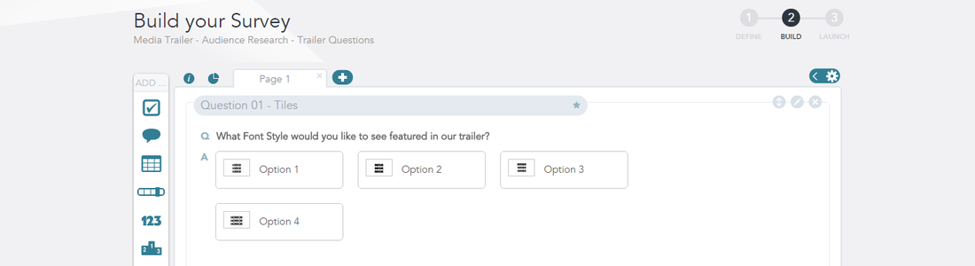
For this section we asked our target audience 10 questions in terms of what they would like to be featured in our trailer. We thought for this section it would be better to record some of our target mentioning there suggestions towards our main product. This was a crucial part in this stage because we are now able to amend our first ideas of how the trailer was going to be shot as well as what we are going to add in the editing stage. The following questions you'll will see bellow include typography, locations, sound etc.
1.What Font style would you like to see featured in our trailer?

Option 1
|

Option 2
|

Option 3
|

Option 4
|
2. Is 8 captions sufficient enough for a horror trailer?
|
Yes
|
No
|
3. In terms of the death of stock characters how would you like that to be presented?
A. A glimpse of their death
B. Full scene of their death
C. A quick snapshot of the antagonist going to kill them, then fades to black
4. Would you like to see the antagonist in...
A. Early scenes of the trailer
B. More towards the middle and end of the trailer
5.What do you think is most eye-catching element when creating a trailer?
A. Sound
B. Editing
C. Lighting
D. Narrative/Synopsis
E. All of the above
6. What Locations do you feel is best for a zombie trailer? (pick 4 out of the 5)

A. A field
|
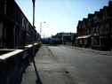
B. A street
|

C. A park
|

D. Flats
|

E. A house
|
7. Should the resolution (the Protagonist resolving the issue/ stopping the antagonist) be shown in the trailer?
Yes
No
Left as a Cliffhanger
8. Should there be a minimum amount of dialogue between the characters?
|
Yes
|
No
|
9. What type of sounds do you think is best for a zombie trailer? (pick 3 out of the 5)
|
Option 1- Loud/Crashing/Bangs
|
Option 2 - Climactic Suspense to create tension
|
Option 3 - Silence/Squeaking Doors/Creaking Wood
|
Option 4 - Sounds from the Zombies - Moan, Awakening, On the loose,
|
Option 5 - Growls/Horror ambiance/eerie sounds
|
10. Would type of lighting do you think is best for a zombie trailer? (pick 2 out of the 3)

A. Daylight
|

B. Dim Lighting
|

C. Dark Lighting
|
Evidence:
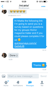
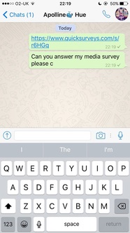
To conduct the survey we used the website quicksurvey.com which allowed us to place visual images alongside our options to give to the audience. Once the survey was launched we were able to copy a link and send it via social media. Bellow shows screen shots of conversations from Whatsapp with some of our respondents. Plus we also wanted are viewers to see video footage of some of our target audience answering a survey which is shown bellow:

|
|

|
Results:
|
|
|
|
|
|
Conclusion
|
To conclude the information gathered from our Trailer survey has helped the group understand what is expected of us which is to meet our audiences suggestions which was : (1) Option 1 should be the typography shown throughout the trailer, (2) 8 captions is sufficient enough in our trailer, (3) there should be a quick snapshot of the characters death, (4) the antagonist should be shown more towards the middle and end, (5) all the important elements listed should be evident through out, (6) locations that should be shown are flats and a street, (7) the resolution shouldn't be show, (8) there should be a minimum amount of dialogue, (9) sound listed against option 4 and 5 should be featured and lastly (10) the lighting should be dark and dim. Therefore its important to follow this in order for our final products to look appealing and to be at high standard of quality work. We've made sure that we've asked people from our target audience (17+), thus the results stay relevant to our concept and treatment.
|

|


Overall Conclusion
To conclude, all the information gathered from the task has highlighted the importance of each product as part of this coursework and we as group need identify each suggestion from all 3 results gathered in order to illustrate that we have listened to our target audience. Once we reach post production stage we should also realise and understand how useful the audience research is. For this reason we should present a high standard of work.
