

Introduction
This is the question 2 evaluation section. This question is going to discuss our film "transient" and how it will be presented in different forms of media platforms as it will allow to demonstrate the combination of the main product and ancillary texts. As a group we will be looking at our trailer, poster and magazine in relation to synergy, continunity , Cross-media Convergence and brand identity. Media convergence is " the merging of mass communication outlets such as print, television, radio, the Internet along with portable and interactive technologies through various digital media platforms" . This is the merging of media platforms to crate hybrid or new forms of media and communication, convergence is the heart of modern digital media and includes DVD, smartphones, TVs, Game Consoles and Discs.
The horror franchise needs to have a strong brand so that they are able to survive and grow; this is something that we will be discussing in this section to understand which we have used to keep our product strong. We are also going to discuss brand identity of transient and look at how it compares to current real media texts and if our brand strong enough to continue that brand of tranzient to develop further films.
The horror franchise needs to have a strong brand so that they are able to survive and grow; this is something that we will be discussing in this section to understand which we have used to keep our product strong. We are also going to discuss brand identity of transient and look at how it compares to current real media texts and if our brand strong enough to continue that brand of tranzient to develop further films.
Examples form the horror genre
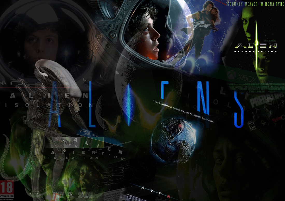
Alien |
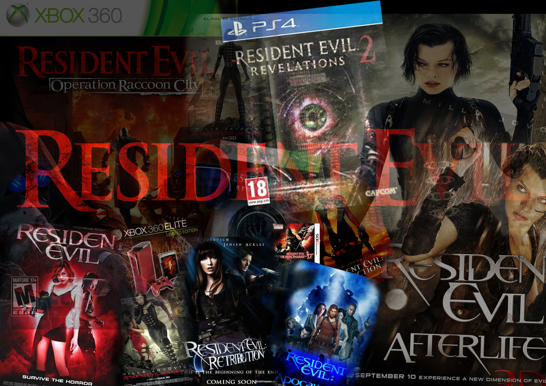
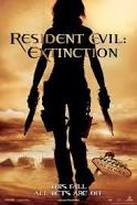
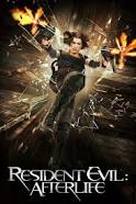
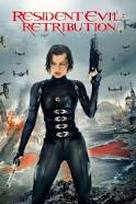
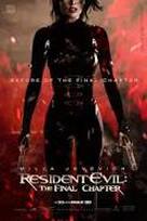
Resident evil |
|
|

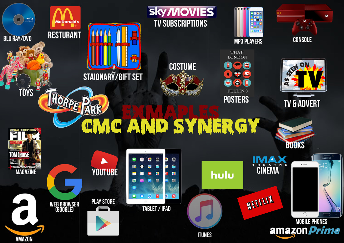
What is synergy/ continuity/CMC/BRAND IDENTITY?
A film success depends on more than just the production of the film but also the marking of the film. Film companies such as Warner Brothers and Disney spend a great amount of money on marking their products. They can advertise a film through different media platforms so the product is widely recognized and, therefore, money is generate through ticket sales of the product. Some of the example are listed below.
Synergy : Synergy is "working together" this means in the media industry where two or more entities cooperate advantageously for an final outcome. This means in the media industry where two or more film companies collaborate to develop a final product/products. This is normally done to develop the success to a film by connecting different areas of entertainment.
CMC : CMC is also similar to synergy as its the combing of two or more media platforms. The different forms can include TV, film, internet, Social media, radio ect. Media convergence can happen in the production, distribution or exhibition within the film industry.
Brand idenity : This is how a business wants to be perceived by their audience. The brand will mainly consist of name, logo, tone, tagline and typeface. This is done by companies trying to bring customer to the market and appeal to customers.

Examples : Film Marketing campaigns (brand identity/continuity)
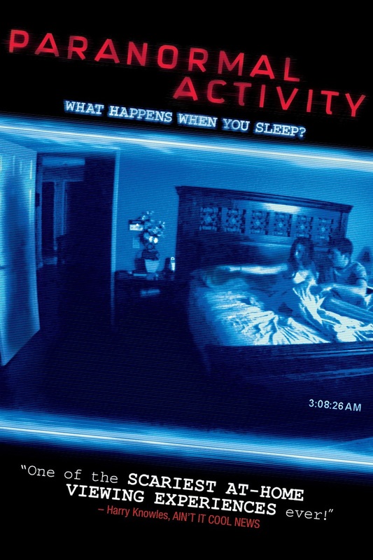
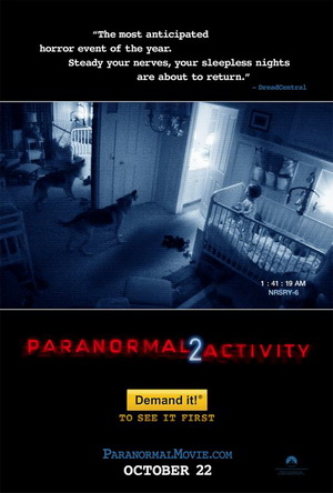
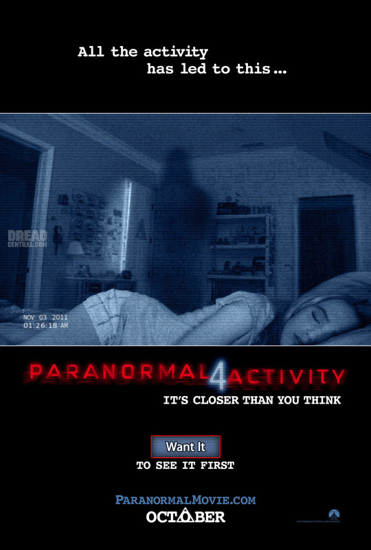
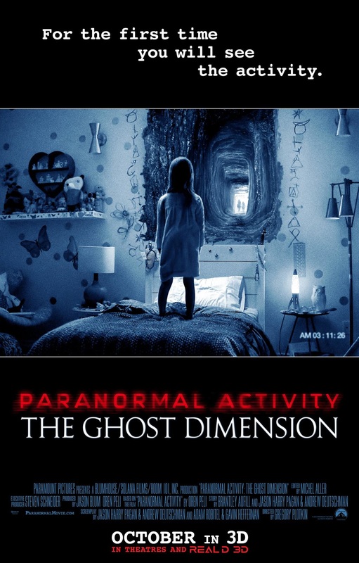
Paranormal activity is an example from the horror genre and is the perfect example of film marketing campaign and CMC. This film although in the horror genre is not apart of our horror sub genre of zombies. But we have chosen this product as executes CMC and brand synergy excellently. Paranormal activity is a product distributed by paramount pictures (2009) and produced by Solana Films, there are 6 follow ups of the film produced all successes with additional merchandise. Paranormal activity was originally written by Oren Peli with sequels such as Paranormal activity 2 written by Michael R. Perry. The paranormal activity franchise has grossed over $398 million at the box office worldwide and soled 374,560 DVDs in the first week and blu ray following with 106,005 sales.
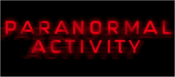
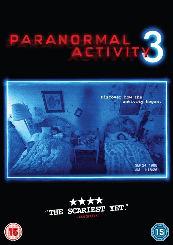
Paranormal activity Series
|
|
|
|
|
|
|
|
|
|
|
|
|
|
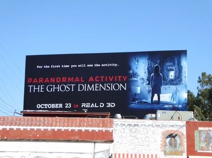
Billboard
|
This is one of the paranormal activity billboards which promote the film. There is a consistent house-style in the billboard sharing the characteristics used by the franchise with the blue and black as the main colours and the red for the film title. The consistent theme and colour scheme help develop and promote the film brand to make it recognizable to an audience. The billboard promotes the common theme used by the paranormal activity franchise by having the time at the bottom right which a common characteristic which this franchise and helps the audience recognize and promote the film.
|
Merchandise
|
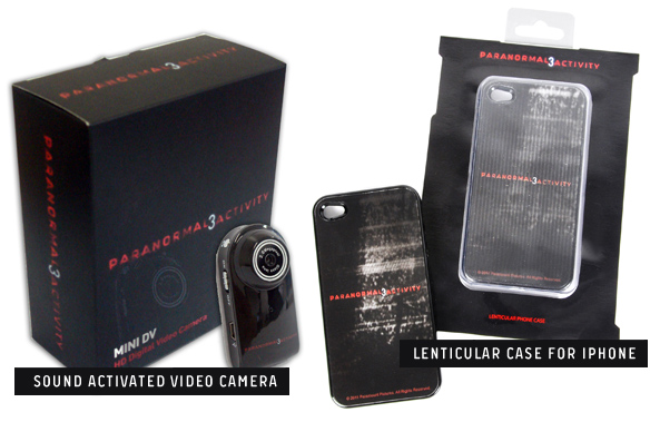
The paranormal activity franchise has also developed merchandise to help promote the film. For example, paranormal activity 3 has inspired a set of products to be develop to help promote the film and the franchise. such as phone cases and camera it helps promote the brand. For example, the title of the film is all over the products to help promote the film and it keeps a consistent them which is shared with the poster as it has the dark red text with the number 3 in the centre. In addition, paranormal activity is known for their films having a "homemade" feel to it which is promoted in the merchandise by having a sound activated camera as this is a product used in the films.
|
|
blu - raydvd
|
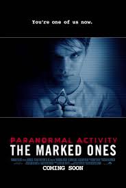
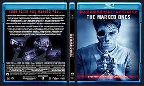
This is the Blu-ray form of the paranormal activity the marked ones. This Blu-ray DVD reinforces paranormal activity developing brand identity as the colour scheme. The colour scheme shares the same colour scheme as all the current posters which is a form of continuity but also develops the paranormal activity brand identity to the audience. The disc also reinforces the brand identity but including camera POV shots which is common in the paranormal activity franchise which reinforces the developing brand identity
|


|
|
|
|
|
|
|
|
|
|
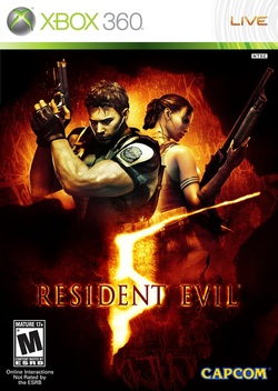
game
|
This is resident evil video game which has been developed due to development of the film series. Resident evil has a strong brand identify although different to the main film series the video game series has developed its own strong brand identity with the video game series establishing it own logo. The success of the resident evil franchise the logo and house dosnt have to be the same for the resident evil brand to be recognizable to the audience. The game series is very successful with video develop 6 versions of the game and variations of the game being developed on other platforms such as Nintendo DS. |
|
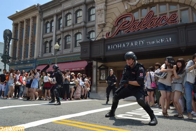
In universal Japan there is an attraction developed from the resident evil franchise. The attraction is call bio-hazard the real and consists of a simulation of what it would feel like to be in the movie. It follows the film to an extent with the incorporation of the umbrella soldiers and zombies. The attract consists of shooting and survival from zombies inside the attract. This attraction shows the brand identity of resident evil.
|
|
|
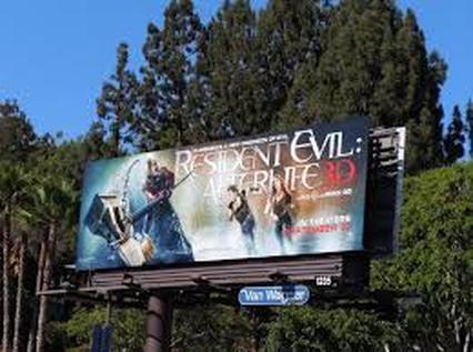
The resident evil franchise has different forms of marketing to develop their brand identity. The billboard develops their brand identity by using the same typography used in the resident evil franchise. This is a form of consistency which is used throughout their franchise. They have also placed the main actor Milla on the billborad which is consistent as she is the face of the resident evil franchise and develops their brand identity.
|

Continuity In The media industry
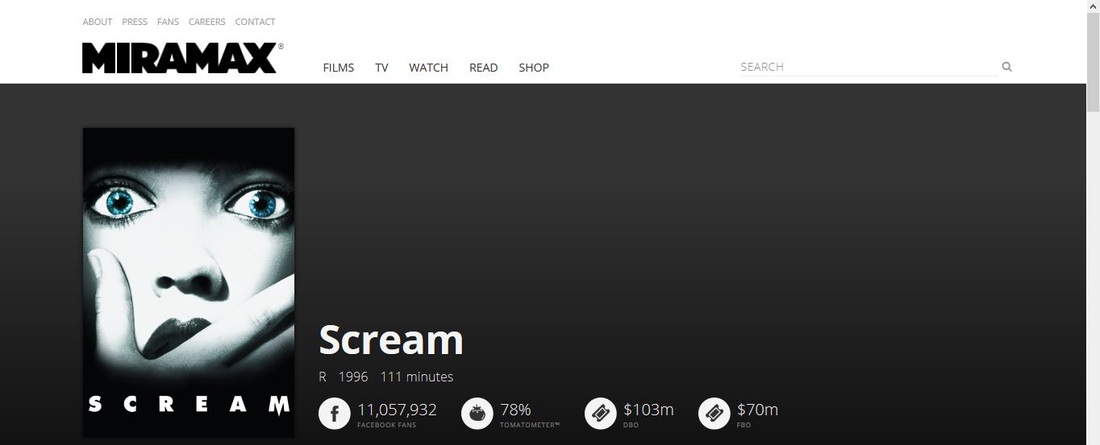
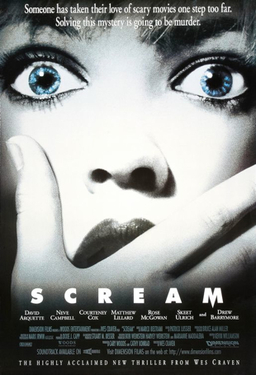
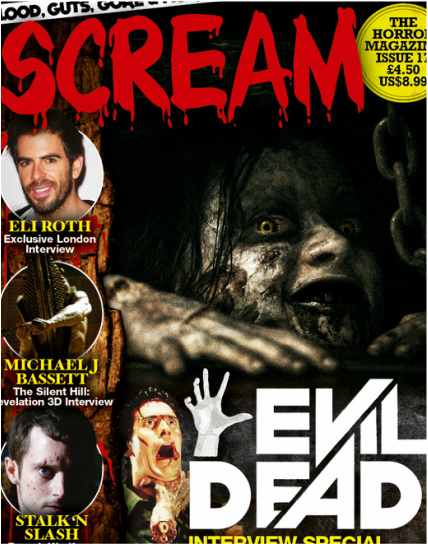
Scream : colour scheme
|
|
|
|
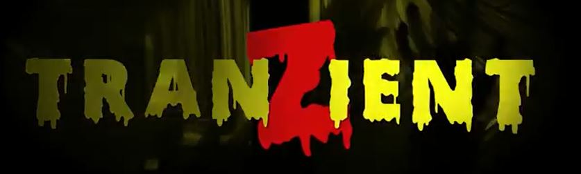
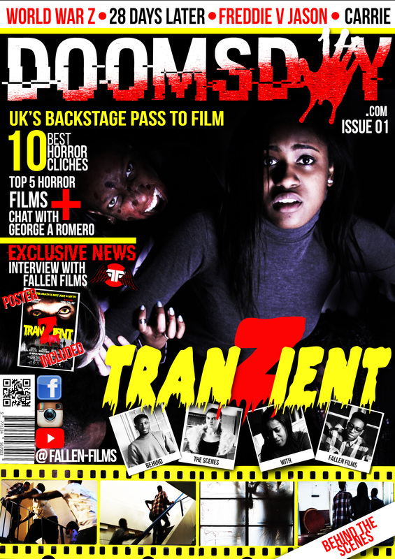
The scream franchise colour scheme is mainly black and white. The scream franchise has developed there products with the same colour scheme to make sure that the audience will understand that they are apart of the same product. This is shown in the trailer where its mainly a dark tint which is reinforces the genre of slasher. We continued this theme with the poster by keeping the the text yellow and the Z in red as it follows the colour scheme on the poster with the trailer. The colour scheme is also followed the magazine when theme and colour scheme is yellow this is effective as it develops a link between the poster and the trailer and establishes continuity between the two products. By developing a similar colour scheme between the products it allows for the audience to establish and link between the two products and demonstrates an effective use of continuity between our products.
Tranzient colour scheme

|

|
|

|
COLOR SCHEME (RANGE OF COLOURS):
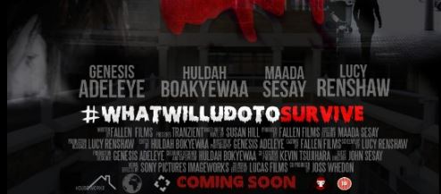
Colour scheme is important element in products as it allows for an audience to recognize and link products developed under a brand as it demonstrates continuity between the products. Our colour scheme is mainly yellow and red with a hint of black in some areas, we developed our products with the same colour scheme to make sure that the audience will understand that they are apart of the same product. The trailer is mainly yellow which shows in the zombies with the yellow of the eyes and the filter used on a large amount of the trailer. We continued this theme with the poster by keeping the the text yellow and the Z in red as it follows the colour scheme on the poster with the trailer. The colour scheme is also followed the magazine when theme and colour scheme is yellow this is effective as it develops a link between the poster and the trailer and establishes continuity between the two products. By developing a similar colour scheme between the products it allows for the audience to establish and link between the two products and demonstrates an effective use of continuity between our products.
Colour scheme is important element in products as it allows for an audience to recognize and link products developed under a brand as it demonstrates continuity between the products. Our colour scheme is mainly yellow and red with a hint of black in some areas, we developed our products with the same colour scheme to make sure that the audience will understand that they are apart of the same product. The trailer is mainly yellow which shows in the zombies with the yellow of the eyes and the filter used on a large amount of the trailer. We continued this theme with the poster by keeping the the text yellow and the Z in red as it follows the colour scheme on the poster with the trailer. The colour scheme is also followed the magazine when theme and colour scheme is yellow this is effective as it develops a link between the poster and the trailer and establishes continuity between the two products. By developing a similar colour scheme between the products it allows for the audience to establish and link between the two products and demonstrates an effective use of continuity between our products.
Typography
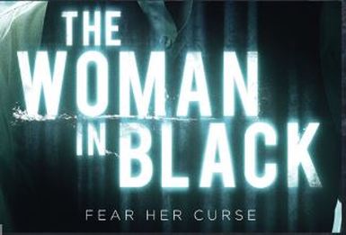
|
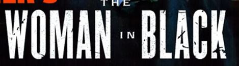
|
The typography used on all of the Woman in Black products is an edited "bebas Neue", which allows for continuation between the products. They have placed the same font on the poster, trailer and magazine. This is effective as it allows for continuity between the products and allows for brand to be established, this is effective as it allows for audience to establish a link between the products and understand that the Women in Black products are all under the same brand.
TYPOGRAPHY

|

|
The typography used on all of the products is "scary Halloween", we have done this to demonstrate continuity. All the products use the same font as it allows to believe an effective link between all the products. We have developed the poster with the main title and the tagline with the scary halloween font as this are the main features seen by an audience. we have continued this by also having the font on the trailer as it develops a link between the two products. We also developed this in the magazine so that it links to the other products developed by fallen films productions. This is effective as it allows for continuity and also our brand identity to be developed by using the same font in the same products as it allows for an audience member to understand that these are apart of the same brand.
Visual Style
|
|
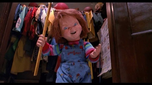
Visual style has been developed with in Chucky franchise with the three products to show continuity. They have develop there visual style by using the images taken tom the trailer on the website banners to make them have more consistency, we have also developed the magazine with images from the trailer as it allows for continuity between the products and also allows the audience to establish a link between the products. The products have a simiukar visual style by retain the same character in all the products to reinforce a link.
Visual Style
|

|

|
Visual style has been developed with in the three products and the website to demonstrate continuity. We have develop our visual style by using the images taken tom the trailer on the website banners to make them have more consistency, we have also developed the magazine with images from the trailer as it allows for continuity between the products and also allows the audience to establish a link between the products. We have developed the poster and the trailer with the same character using the main zombie at the end of the trailer. To allow for visual style we have developed the poster and the magazine to incorporate the main zombie, with the main poster this is placed at the top, however, we wanted some variation with the magazine so we have fully shown the main zombie but it behind the main female subject as it still allows for continuity between all the products.
LOGO
The logo is an unique identifier this links our products together. This is an effective way to promote our products as the symbol can tell an audience a large amount about a products and is the face our most brand idenities with the media industry. We have developed our products by placing the logos on all our developed products as it allows for us to develop our brand identity and helps and audience understand that our movie product is apart of the group and also helps promoted the film.
SHOT /FRAMING
|
|
Shot /Framing
|
|
|
|
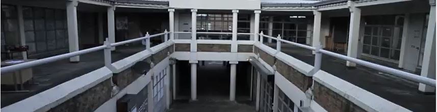
We have developed continuity between the three products and the website by placing similar shots on all the products. We used establishing shots of the location in the films and placed it on the poster and magazine. We also used stills from the trailer on the poster, magazine and website this develops recognition as it allows the audience to identify that the products they are looking at are a part of the transient brand. We have developed a dark background in the trailer which we have developed in the poster, magazine and website. We have developed this as it allows for continuity to be established when the audience are looking at the different products as it allow for the audience to understand and identify that they're a part of the same product of tranzient.
Protagonist / Antagonist
|
|
|
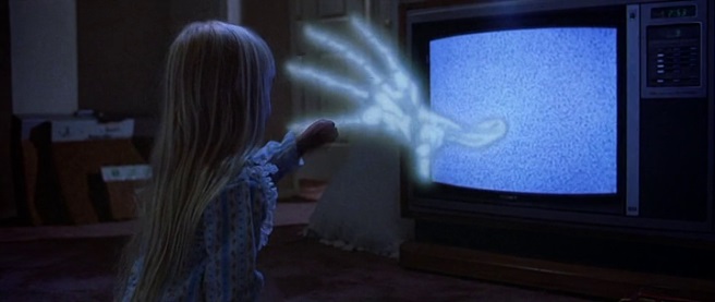
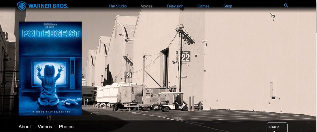
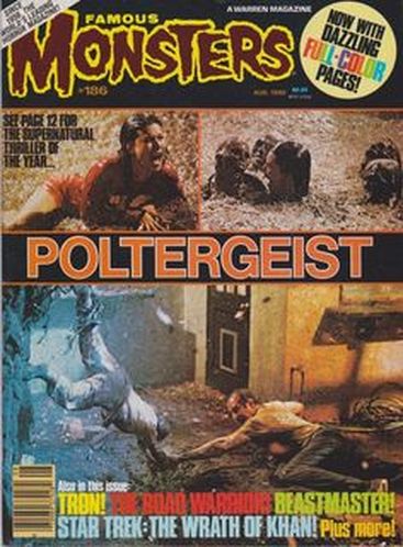
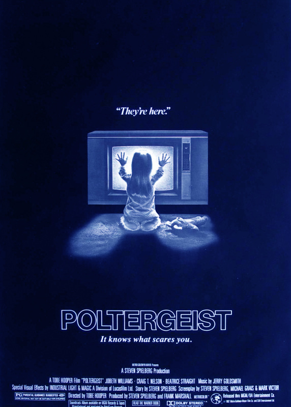
The poltergeist franchise has developed their products with both protagonist and antagonist. The small female child is present on the poster, magazine,website therefore, allowing for a link to be established between the products. This is effective as it allows for continuty and the audience to understand that their is a link between the products. In addition although the audience is unable to see the antagonist the audience is still able to feel the present. This is shown with the magazine and trailer where the characters are being taken this allows for the antagonist to still have a strong present and still develop continuty between the products.
Protagonist/antagonist


|


|
We placed shots of the protagonist in the magazine and the poster to establish a link but also to show continuity between the two products. The poster and magazine link to the trailer as they contain the same shots of the protagonist, we have done this to establish a continuity between the three products. This is effective as it allows for the audience to look at a protagonist and understand that they are apart of the tranzient brand. We have also developed shots of the protagonist with the three products to promote the Zombie genre but also establish continuity between the products. The magazine has a main protagonist which links to the poster which has our main cast member scott, these shots link to the trailer which shows the main cast members.
Lighting
|
|

|
|
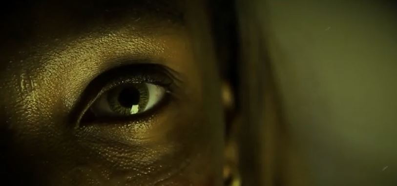
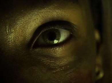
Lighting is a key element within our products as it allows for use to develop and focus on the facial area. We have developed the lighting to focus on mid height and predominantly focus on the face to enhance the features of the zombie but also facial expressions. This allows for more effect on the eyes which is our USP and also develops a link between our products.
props
|
|
|
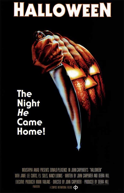
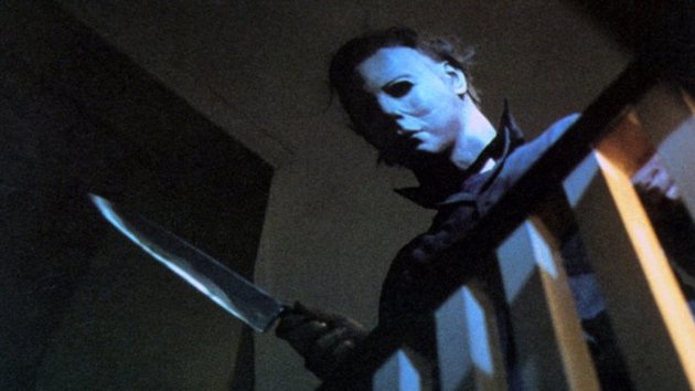
In the Halloween franchisee the props used is a mask and a knife. The masked is used to hide the characters identity from the audience to allow for mystery. This is continued in the products to establish continuity between the products. This is also continued with the use of the knife, the knife is the primary weapon for the antagonist this is also shown in the poster with develops a link between the products and allows for continuty to be established between the products. This is effective as it allows for the audiences to create a link between the products.
Props

|


|
Our USP was the yellow eyes this meant that we has to use yellow eye contacts when developing our products. This is effective as it allows a link between the products as the audience. This also links to our colour scheme of yellow which creates continuity between the products this is effective as the audience will be able to establish a link between the products.
Overall summary of continuity areas - GENESIS

Cross media convergence : Tranzient Products
Portable electronics
Apple inc.

Macbook Pro (Tranzient Edition) 2016

IPhone 6s (Tranzient Edition) 2016
|

IPad Pro (TranZient Edition) 2016

Iphone 5s (Tranzient edition) 2016
|
Apple had developed a partnership to develop products based on the Tranzient films. This is effective as it allows for our brand identity to be developed with the tranzient products. The products developed by apple have shown the success of the tangent brand as it want to be adopted by other companies. This is effective and should bring more success towards the film as the concept is a form of advertising as an audience to pre chase the products and which will show our colour scheme. This will be recognised by people which will attract attention to the films. This is an effective marketing tool as the tranzient identity has been developed onto apples most popular phones meaning that more people will see the products and recognise the transient brand which will bring more success to the tranziet film product.
|
Samsung Electronics : Phones
|
Samsung has developed their flagship shines with the tranziet colour scheme due to the current success of the film. They have develop a current concept of developing their phones to have the colour scheme of the transient brand. this is effective as it develops our current brand identity and is also an effective form of advertising as it allows for our brand to be spread as the public will be able to recognise the colour scheme and understand or question what brad that is apart thus bring more success and attention to our film. They have chosen to develop the colour scheme on their best selling phones as it will effectively promote our film better by placing it on their best selling phones as more people will see the developed product and understand that its apart of the tranzient and therefore bring more attention to our film.
|

Samsung galaxy s6 edge plus

Samsung galaxy s6
|

Samsung galaxy Note 5

Samsung galaxy s6 Egde
|
Google Nexus

Google nexus 5X
|

Google nexus 6P
|
Google is a major company that also develop electronics, they have developed are partnership with our company to brand their best selling flagship phones with the Tranzient brand colour scheme. This allows to understand that our film is success as Google have develop a concept where their nexus line will be changed to yellow and red to match the colour scheme of tranzient brand. This is effective as it allows for another form of advertisement as our brand will be promoted via the phones and Google meaning that film will have a higher chance of success when it release in box office. this reinforces our brand identity as it makes it promotes the tranzient brand. The use of CMC and Synergy is effective as we will develop a larger target audience as the tranzient brand is being adveristed in a larger area of the media industry. The Google Nexus 5X and 6P are google flagship version phones and are budget super-phones meaning that these phones will ave a large target audience which is effective as it will advertise the tranzient film to a larger target audience.
Games Console
Xbox One
Xbox One
Xboxs are one of the best selling games console in 2015 and continue to dominate the in gaming and entertainment with more people opting to purchase an xbox over and TV subscription due to the wide range to medias that can be utilised on theconsole. We have developed a partnership with mircosoft to develop 100,000 xboxes with the tranzient colour scheme, we done this as it allows for another form of advertising rather that using the conventional means such as billboards and tv adverts. We believe that this an effective way to promote the film and will develop our brand further and also grow our audience.
|
Playstation 4
Playstations are one of the best selling games console in 2015 and continue to dominate the in gaming and entertainment with more people opting to purchase an Playstion over and TV subscription due to the wide range to medias that can be utilized on the console. We have developed a partnership with sony to develop 250,000 playstations with the tranzient colour scheme, we have done this as it allows for another form of advertising rather that using the conventional means such as billboards and tv adverts. We believe that this an effective way to promote the film and will develop our brand further and also grow our audience.
|
tranzient youtube channel

We have just released our tranzient trailer and it has over 2 billion views on youtube. Its currently the most viewed video on the internet over videos such as PSY and Pewdpie. The success on Youtube has allowed for our brand to grow massively. Youtube is an effective way to promote the film as its a free service that can advertise the tranzient brand worldwide, this has shown with the tranzient trailer being the most view film in the USA in the month of January.
Tranzient Soundtrack

Fallenfilms have partnered with Adele to create a sound track that will also feature on her upcoming album 25. Its currently Number 1 in the UK and US top 40 charts and has sold over 1 billion records. This is an effective way to promote the tranzient brand as it allows for more people to learn about out brand via other means such as music. In addition, the music will also allow for a link as the audience will recognize this and link to other products such as the trailer.
Tranzient rollercoster
|
This is the tranzient roller-coaster that has been recently opened in Thorpe park UK. This has been voted most scariest ride in the UK and has been restricted to 18 year olds only. This is effective as it develops our tranzient brand.
|

|
Transport for London

|

|
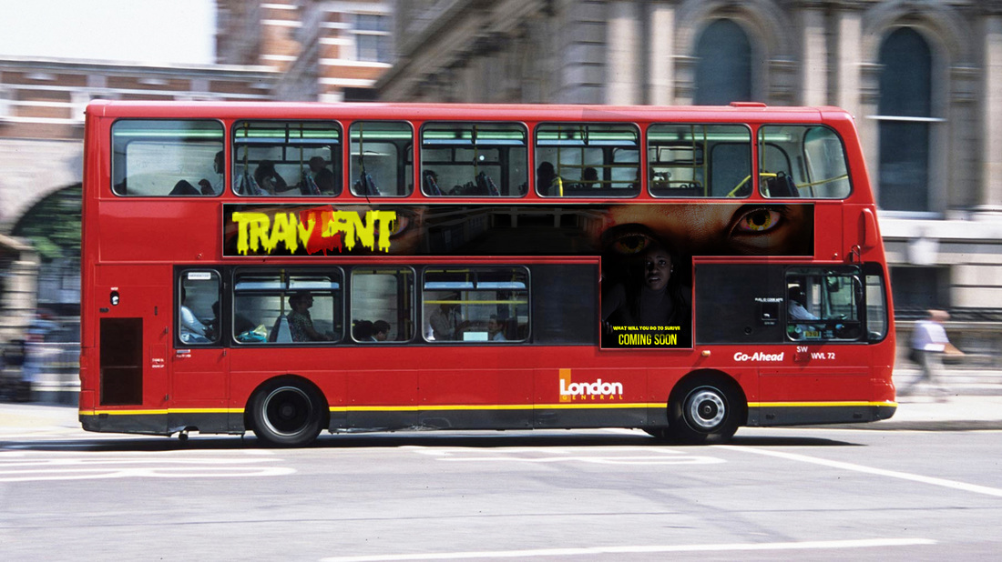
TFL has developed the colour scheme of yellow and red on the new 2014 Routemaster. The colour scheme is on the main part of the bus which makes it standout to normal London buses which are mainly red. This is effective as it makes it stand out to the normal red of the buses, this is effective as a audience member will recognize the colour scheme and understand that the bus is apart of the Tranzient brand which is effective as it promotes that tranizient brand the a large populated city. TFL has decided to place it on the route 11 as this is a high frequency route in London meaning that more people with see the colour scheme and link to the tranzient brand thus gaining more success for the film.
|
|
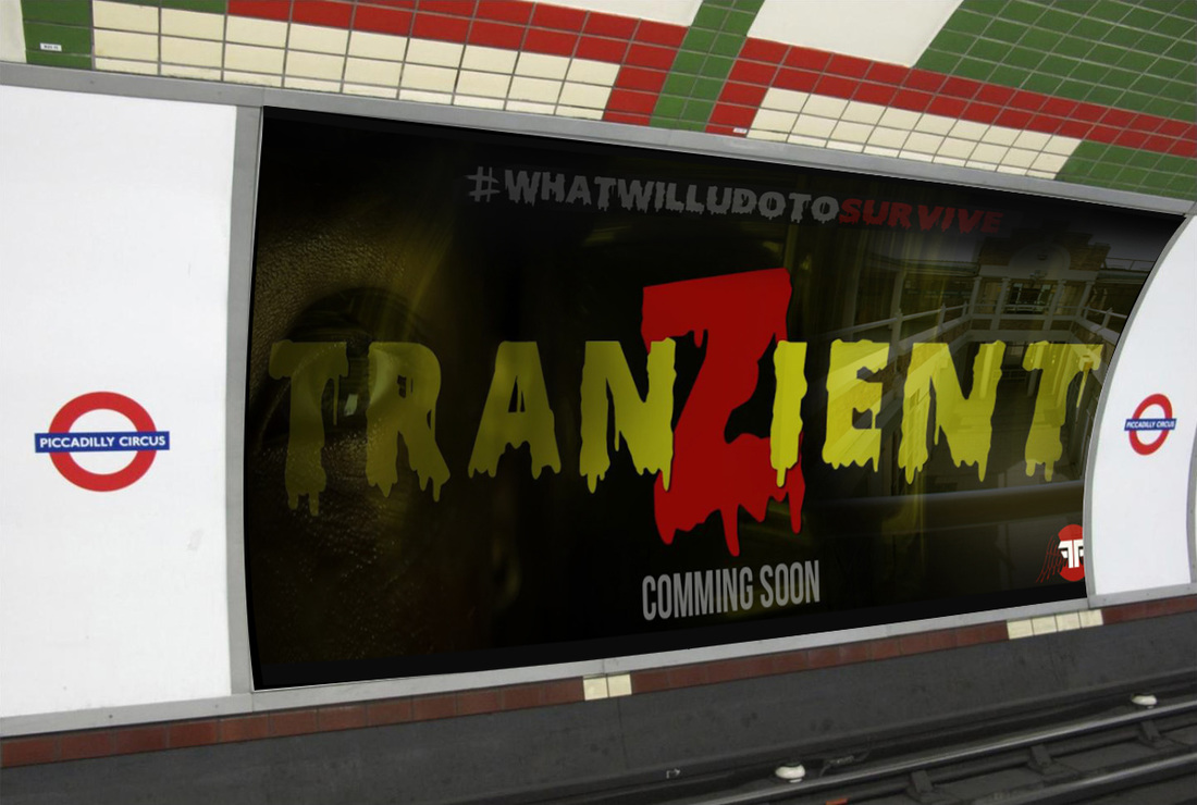
Our poster has also been placed in busy areas of London such as Piccadilly Tube station and on may London buses. This allows for our brand to be promoted around London, therefore, growing for successful for the Tranzient brand. We have promoted it on london buses and London underground as over a million people used these forms of public transport a day which is effective for the tranzient brand as more people will see the products which will allows for the tranzient brand to develop.
Media streaming Platforms

|

|
The magazine and poster have been released on Google play service such as the magazine and Movies section. This is effective as it allows for the Tranzient brand to grow as the audience will be able to purchase the product. This can lead to sequels in the film of the product if the product is successful. We have promoted it on the Magazine area as more people convert to online.
|

|

|
The film is also being promoted on video streaming services such as YouTube Red and Amazon Prime instant video. This is effective as it target audiences that use thise service meaning that our brand is able to grow. We have used amazom prime and Youtbue Red as they're new services with a growing market of teen in the age rage of 17-20 which is our target group.
Public Advertising

|

|
We have promoted the tranzient brand using the conventional way of public advertising this includes billboards and bus stops. This is effective as it allows for the tranzient brand to grow. Moreover, we have placed the advertisements in ideal placed so that they are noticed by the public.
Tranzient Sequels

|

|

|

|
The tranzient film was very successful in the box office grossing 527 million, due to the success this developed sequels to be developed to contuine the success of the tranzient brand. Each tranzient film has been so succefull that it has developed another one after which is effective as it develops the tranzient brand.
Conclusion
To conclude as a group we believe that we have developed our brand identiy effectively using continuity and Cross media convergence within the main products. We have developed our products with recognizable element of continuity that allows for our audience to establish that tranzient brand, moreover, we have used continuity and Cross media convergence to promote the tranzient brand effectively. The effective use of continuity in the magazine, poster and trailer allow for a identifiable package when promoting it to an audience. In addition, the effective use of advertising the products allows for an established link between the main products thus providing and effective media package that can be promoted to the chosen target audience. In addition , we believe the use of billboards, bus stops and the internet to promote the main products is effective as it allows for the Tranzient brand to grow. Overall ,we believe that we have effectively developed the Tranzient brand through advertising and continuity to develop our main products and brand identity.
