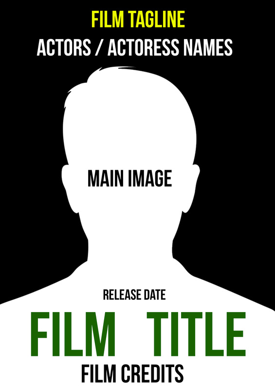
This is the print design I am required to produce drawn and digital drafts for my chosen concept. I will make a magazine cover and poster which includes all the conventional elements. In addition all elements will be annotated. Moreover, I will complete some test photography for lighting and composition ideas. In addition I will include digital drafts and magazines that I like from the chosen horror genre. All of these will have annotations to explain what I have done with each section.
Real Media Texts : film poster
This is the real media texts sections, this is existing film poster texts that relate to the horror industry. We have picked the real media texts that we like as a group and what inspired us for our film poster.
These are the film poster relating to the horror genre, currently their are 5 annotated film posters which relate to the horror genre. Moreover, as a group we picked these 5 poster and discussed what we liked about them. We decided to find films posters that relate to our horror genre as the would allow us to understand how to develop or final piece.
|
|
|
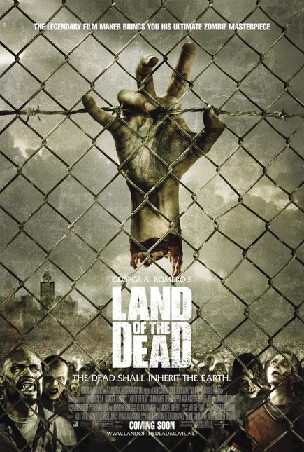
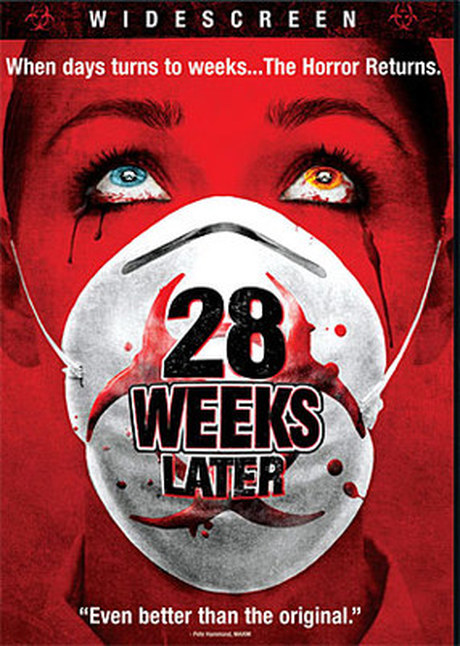
The grouped liked this poster due to the image as it relates to the horror genre. We liked the main image background of grey as it connotes Zombie. This is because zombies skins are normally grey and the poster reflects this with the colour scheme as zombie are affiliated with the colour grey. We also liked the way the film poster has used a fence this connotes that the zombies are quarantined. This is a common connotation of zombies being sectioned due to them being "infected". This simple use of a fence has a powerful connotations. Moreover, the hand hanging off the fence reflects the zombie genre as zombie are rotting, we liked this as it connotes the horror genre.
|
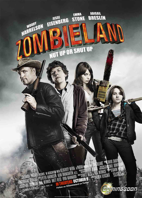
We liked this as a group as it promotes the zombie horror genre without having a zombie in the shot. We like as a group who they are using a canted shot. This connotes that there is chaos. Which is also represented in the background of the image where the smoke and devastation. Moreover, we liked how the main character are holding weapons. This is a common feature for Zombies as these are common weapons killers, these reinforce that this is a zombie film to the viewer.
|
|
|
|
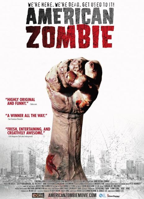
We only liked one aspect of this film the way the hand is pinching out the ground. Other than that we didn't like the type of font used as it feels urban and distracts from the zombie feel. We like the hand punching from the group as it connotes many things such as a zombie has just been re amimated and is ready to come back. Moreover the way his fist is placed this connotes that he wants respects this sets the tome for the film that possibly as a zombie he isn't respected and when he returns he wants respect.
|
We like the way the image is canted as a reader it makes you feel panicked. This is a common contation with the zombie genre as they are relentless and will stop at noting to eat you. This is how the image made the reader feel like they are running or falling while looking back. We also like the way the image is distorted this is common in the horror genre as the image is distorted to emphasise some features on the zombie to make it scarier. We also liked the type of font used for the mast head it simple however due to it being distorted it emphasises the fact that this is a zombie film and the chaos.
|
Drawn Drafts : FILm poster
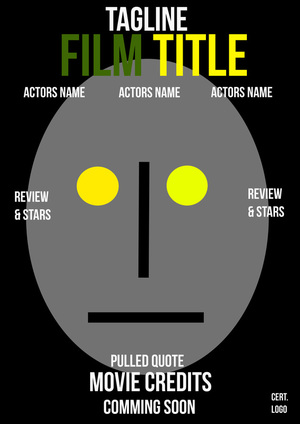
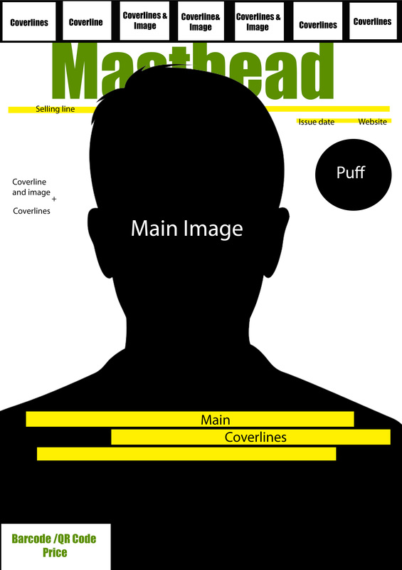
This is the drawn draft for the film poster. For this section I have developed a sketch of what the magazine might look like and convention we might have in our final product. This section will consist of 4 basic drawings relating to our zombie genre. The film poster will have common conventions placed on film posters and will have a main image relating to the zombie genre and our trailer.

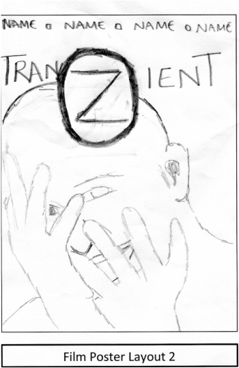
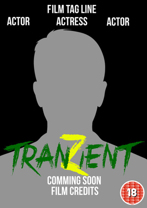
For this film poster i have tried to follow the ascpect of our chosen genre zombie by having a close up shot of a zombie triing to burst out of the poster. We have not finalised a final look for our mast head. However, for this one i have used our film name but the Z in transient is larger and encompassed . I have done this to reinforce that this film is a zombie film and this connotes how a zombie is always contained and truing to break free. I have also placed blood on the film title as this connotes the genre f zombie as they are always lusting for blood and this reinforces the reader that its a zombie film. I've kept it simple for now with the credits.
|
I have mag this very simple but amplifying the horror genre. I have drawn a person transforming in to a zombie. The masthead is supposed to be distorted / kinda starched. This is a common connotation for the horror genre as the horror genre normally uses distorted text to make the reader feel scared. i have done this to give the poster a more horror feel. The encompassed Z is lager on this poster as i wanted to emphasize the zombie. Moreover, the zombie logo is circle this connotes that the zombies are trapped
|
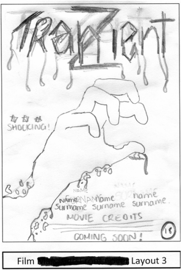
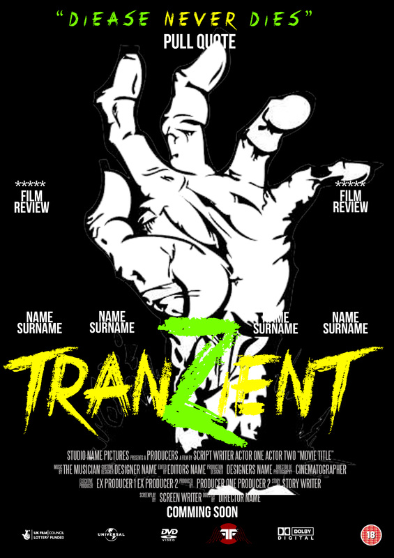
I have tried to use a simplistic vibe for this film poster. I have drawn a rotting hand which symbolise a corpse rising from the ground. This a common connotation for zombies and the genre as they are the dead reanimated. I have tried to used a sharp look for the masthead as I wanted the page to stand out. Moreover the masthead has blood dripping from the zombie this is similar for Zombies as they have blood dripping from their bodies as they need fresh blood to survive. I have also included a review as I wanted to amplify how scary the is.
|
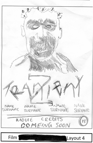
This poster I have enlarged the main image of the zombie so the reader will focus on the main image. I have tried to make the zombie look like the skin is rotting off. Morover. I have developed the Z as it connotes that this is a zombie film. Moreover, the masthead is distorted as this is a common connotation with in the horror zombie genre. I have distorted the image and the font to connote a bio hazard situation as in a bio hazard there is trauma. I have tried to replicate this with the font by distorting and rotating the font.
|
Digital Drafts : Film Poster
This is the digital film poster draft . This was developed using a basic colour scheme as the audience research has not been developed yet, this developed allowed to see what the group like and what we would keep for the final draft.
This is my first digital draft, this is just a basic layout to give me an idea of where I want things to be placed. I have done this so that when I develop my digital drafts it will be easier for me to develop as I have a rough idea of where everything should be placed.
This is a more develop digital draft with the masthead of our film "tranzient" and the layout is more developed. I have tried to make a close up shot of an eye which has been infected to promote the film genre. In addition I have developed the credits with more of the things that I am going to add. Moreover, I have added the logos for this poster as I want to have a general layout of where I want the logos to be placed.
|
For this one I have developed my first draft by adding the name of our film and the cert logo. I have done this so I can have a general idea of where I want my logo to be placed and see if it should be moved. This overall is very simple layout that gives me a general understanding of where I want things to be placed.
For this I have removed the film name and changed it back to film title. I have done this so I can have a simple design that I can move about. As you can see I have developed from the second draft by creating a zombie-like figure which relates to out genre and film. I have also moved the title to the top of the page and the developed the draft by adding more convections to give me a rough idea of how I want it to look.
|
Ive kept it similar to the old layout digital draft. I have just changed the picture as I want to see which is the best image to have on the poster as it will help influence my draft pictures.

I have developed this into a final draft template for my edited drafts later on when I will be adding the audience feedback. I have added credits and developed the tag-line. Moreover, I have developed the layout out to a higher standard as it will help with my layouts of my poster in the future.
|
Edited Drafts : film poster
This is the edited version of my digital draft showing the development of my Film poster with the changes made due to the feedback given to the audience research. I have shown the progress of hoe my magazine and poster was developed and how I implemented my audience research.
|
|
|
|
|
This shows the development of the final draft for the film poster, this shows the process that I went through went developing the final development.
Working Drafts: Film poster
|
This is the basic back drop of the layout which is A3 international paper with an aspect of 42 H : 29.7 . I have done this so that the images are not pixelated and look unprofessional.
|

|
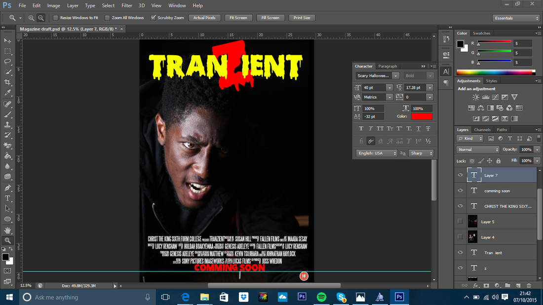
I have started to developing the film poster with the credits. I have developed the credits using steel tongs font. The credit will consist of the roles that are normally in films. I have tried to make it look credits that you would normally see on poster with the top longer than the bottom. I have also added the certication age logo of 18 in the bottom right as this is a common position for this logo.
|
|
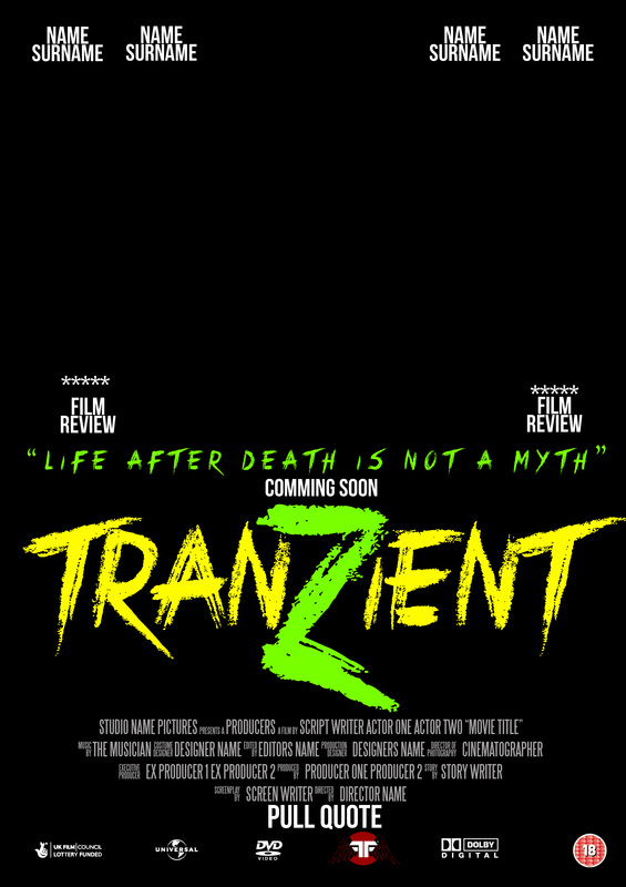
I have added the main image to the film poster I have chosen this images as the lighting shows the contacts well. This is what we were going for when developing the image as we wanted an obvious zombie theme.
|
|
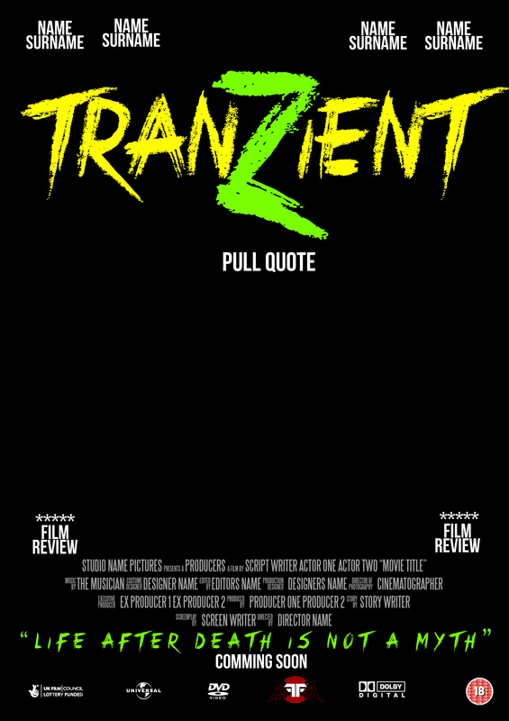
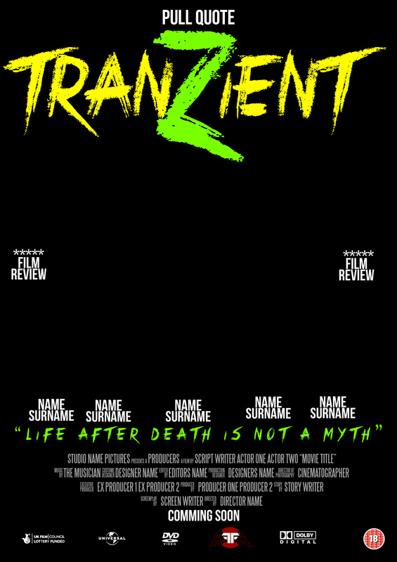
I them developed the masthead of the film poster by developing the font scary Halloween in yellow and enlarging Z in the middle to make it like a logo. I have also added the coming some in the same text and I have mad it red to match the red in the Z. I have made the Z large to connote a zombie film.
|

|
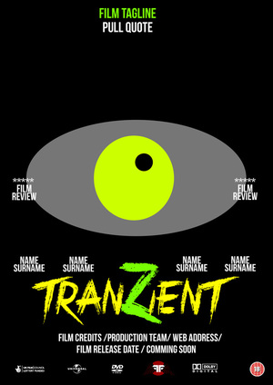
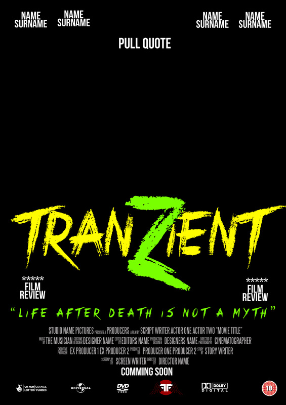
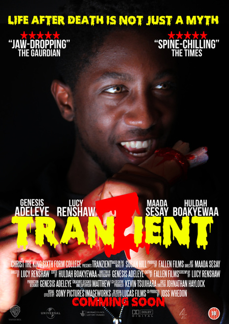
I have made some changes to the final layout to make it look more professional. For example, I have developed the tag ling in the same font as the masthead and I have also added pull quotes and ratings to make it look more professional. I have also developed the actors names in bebas nueue and I have placed them above the masthead with I have moved to the middle-bottom. I have also added the production company logos at the bottom of the page and I have made them transparent which is a similar to current posters.
|
Real media texts : magazine
This is the real media texts sections, this is existing horror magazine texts that relate to the horror industry. We have picked the real media texts that we like as a group and what inspired us for our Horror magazine.
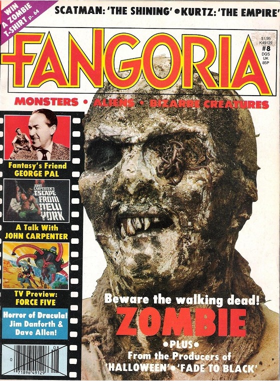
This is the existing horror magazines, For this section as a group we discussed and picked 6 magazines that we liked the look of ; then we discussed the main features and what they connote. All these magazines relate to the horror genre but some relate to our chosen genre as we wanted to see how Zombie magazines structure their magazines as it would help use with out final piece.
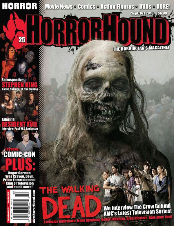
As a group we liked the colour scheme if black and red. This is a common colour in horror as it connotes blood and evil forces. This also ties in well with the walking dead as the zombies are thirsty for human flesh. We also like the way there is a mid shot of the zombie who has been placed at the centre of the magazine. This magnifies it features and make it look decapitated, therefore making it look more spooky. We also like the look and layout of the magazine cover-lines as they are bold with striking images. They also include the horror element within the cover lines as they with the blood marks placed around some of the coverlines and is a common connotation with the horror genre.
|
From this magazine we liked the close up shot used for the front page which promotes the Zombie Horror genre. This magazine has a worn look to the magazine which symbolises that the magazine has a zombie feel to it. In addition, we like the masthead as it looks ancient. This is a connotation that it looks worn and decapitated, this is a common connotation of zombies. Moreover, we liked the cover lines as they enhance the zombie feel of the magazine.
We also liked the main image of the magazine as it reflect the horror genre of zombies with the main subject having rotting flesh. Moreover, we also liked how the image looks like a zombie is being locked out this connotes the horror genre of a zombie hunting a human. This is a strong image as it mages the reader feel like the images is trying to escape from the magazine. |
As a group week liked the simplicity of the magazine front page. We liked the cover lines as the use a film reel which connotes a movie feel. In addition, we also liked the tag line "monsters-aliens-bizarre creatures" this connotes that its a horror genre. In addition, the mid close up shot of the Zombie promotes the horror genre and promotes the movie. We also liked the typography as of the magazine as it simple but doesn't distract or take away from the magazine and the horror genre.
The main image reflects the zombie horror genre with the rotting flesh of the main image the worms in the left eyes make the reader believe that the zombie has been buried in the ground for sometime and recently just risen out of the ground. |
We liked the magazine cover as its appealing with the simplistic layout. The magazine has very little cover-line which doesn't distract from the main image, This is also the same for the main cover-line its simple but adds to the main image and the horror aspect. In addition, for the main cover lines to stand out its bold with a different colour. This makes it bold and stand out. The magazine uses mostly red in the layout of the magazine this colour connotes the horror genre as it reflects evil and blood.
The main image is bold and a centred as a group we liked this as it allow the reader to focus on the main image. |
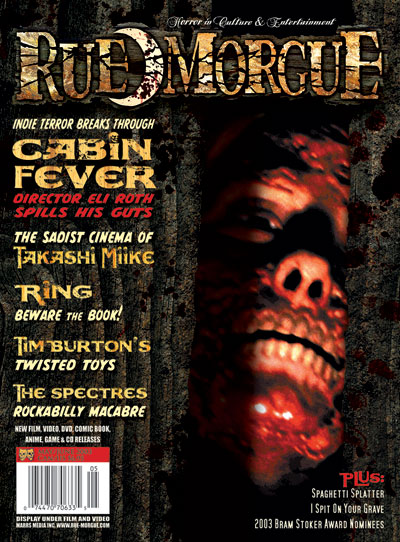
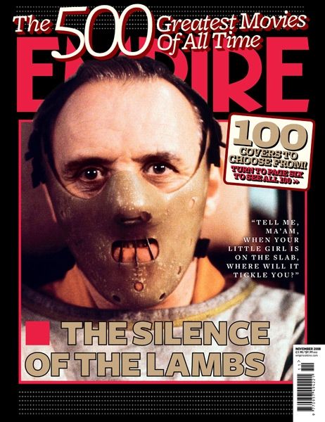
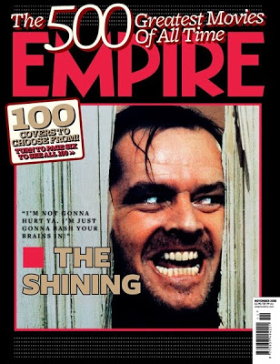
Although this movie is not apart of the horror genre this magazine as a grouped we really liked but this magazine does have connotations relating to horror. We liked the masthead with the colour red being used the colour red hold strong meaning and connotes evil. In addition, the masthead is also on fire this connotes hell and evil, this connotes the horror genre as it reflects hell and the devil. The background is black this holds a strong connotation to darkness. In addition the main subject in the main image is the colour red, this connotes that the character has evil background as red connotes blood and rage and reflects that horror genre. We also liked how the character has prayer beads around their forearm. This is a strong reilgious symbol. This has a strong presents in the horror genre as it connotes good over evil. This has a strong presents in horror genre as religious symbols are used to overcome the evil villain and this reinforces that the character is evil and uses reigilon to overcome evil.
|
We liked as group this magazine cover as it simplistic. The magazine uses that tag- line of the film to promote that film. The cover-line is dominant as it aids the main image, we like how the main image is busting. This give the reader the feeling that the main image is escaping from the magazine. This magazine also uses red as a dominat colour this connotes evil and power which is a common connotation in the horror genre. The main cover line is simple and to the point and the only thing placed at the bottom of the image. The simplicity is powerful as it isn't doesn't need to pack the front page to promote that its a horror film.
|
drawn drafts : Magazine
This my drawn drafts for the film poster and magazine . This is where i plan and sketch what I want the magazine to look like. This will consist of 8 drawn drafts (4 Film magazine & 4 film poster). Each will consist of the masthead and other conventions included on the magazine and poster, It will also include the photos relating to the genre that I have chosen. On some i have not included colour to make it look original and i wanted to wait for the colour scheme to be chosen by the target audience which I will incorprate in the digital drafts. We have chosen to call the magazine doomsday but this is not the final name chosen.
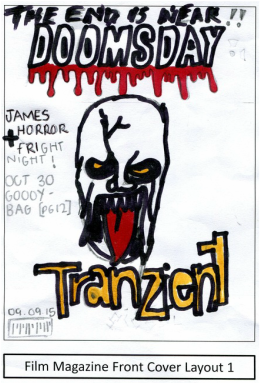
This magazine was to be based around the horror genre. The tagline reinforces this with " The end is near!!".
We have done this as it suggest that this magazine is a horror magazine as death and "the end" is common associated with the horror genre. The masthead connotes the horror genre as there is blood dripping from the mast head which makes the reader feel like their has been a death. The main image is related to the movie and has a mid close up shot of a zombie which is the antagonist in the film. The cover lines are simple to not distract the reader from the main cover line which is the film title. I have tried to keep this simple by only keeping cover lines on the left third. |
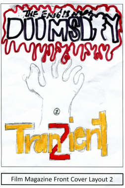
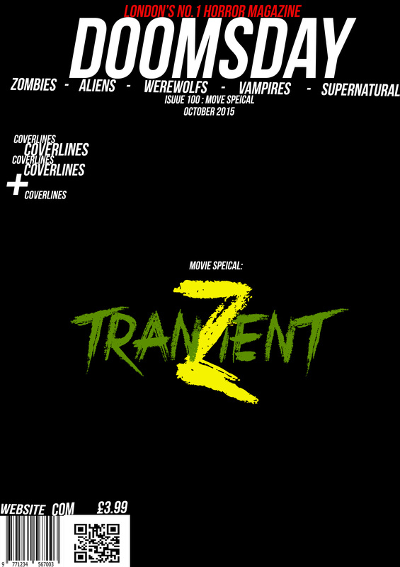
This magazine was also based around the horror genre with the blood encircling the mast head. I have done this as it promotes the horror genre for the magazine to the reader without having to see the Masthead. The blood connotes death and sadness this is commonly associated with the horror genre. By having this on my magazine it strong reinforces the horror genre to the reader. Moreover, the masthead is simple however I have tried to incorporate the horror genre with this mast head unlike the other by replacing the "A" in doomsday with a mushroom cloud, this connotes devesation and the end which is apart of the horror genre. I have done this to give the horror magazine a more strong horror feel to the reader and try to incorporate a logo in to the magazine. Ive included only the main cover line on this magazine to promote the film as the reader may be distracted if their is a a lot of information on the front page. The main coverline is yellow but the z is larger and red to promote the zombie aspect in the film.
|
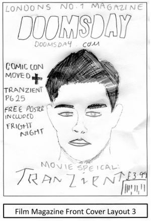
I've gone from a different approach for this magazine, i have tried to follow magazine companies such as empire and entertainment as they are not horror based magazines but feature horror films on the magazine. I have tried to give the magazine a generic feel which shows in the mast head " London's no.1 magazine" this connotes that its a normal magazine which covers a large amount of topics. The main image is a close up shot of the protagonist. I have done this to make it feel like its a magazine taking about the star more that film. I have tried to add the horror aspect to the magazine where I have included the film title in distorted text. I have done distorted text as this is a common connotation with the horror genre where text is usually distorted to make it look and feel more scary.
|
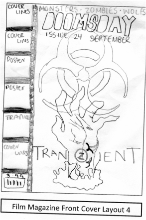
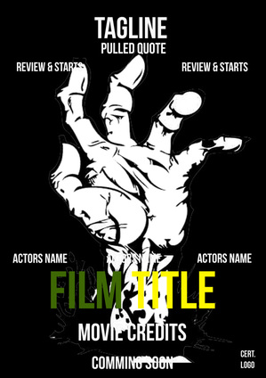
With this magazine I have gone down a horror feel unlike no.3. With this front page I have developed a masthead which is bold and simplistic however does'nt appeal to the horror genre aspect. I have also included a features at the top of the page to give it a more horror feel, by including " Monster, aliens and werewolf", this give the reader a strong understanding that the magazine is a part of the horror genre. I have also tried to reinforce this with the movie picture i have used a hand bursting out the page and the bio- hazard sign which connotes disease and is a strong symbol normally used for zombies. I have tried to make the left tired appealing while still keeping the movie aspect, i have done this by using a film reel as it connotes and reinforces that this magazine is a movie magazine.
|
Digital drafts : Magazine

This is my digital magazine draft number one. Its a simple layout which has allowed me to understand where I want things to be placed. 
For this I have only developed the look of the main coverline. For this I have got rid of the white box and I have developed it by using a film reel to develop the look of the magazine. Moreover a film reel is a common convention on many film magazine as they stand out from other magazines. |
I an currently experimenting which the layout by changing where things are on the page. I have tried to give it a simplistic look by reducing the amount of coverlines on the page and keeping the main coverline bold but simple.

I have developed it further by using a more strong font #2bebas neue" and I have added and developed some of the elements to give me a more developed template that I can work from. I've added the title of the film as this is regarded as the main coverline so I want to see what I need to do and where I want this to be placed.
|

I have used the digital draft number one and I have developed it as I liked the layout more than number 2 as it give a more movie like feel than number two. For this I have just develop the main image and changed the colour scheme a small amount.

This is the final draft template which I am going to using later on to add the audience feelback. I have developed the magazine by adding elements to the magazine such as the masthead name "doomsday" and the magazine tagline ad I wanted a developed template to give me an idea of what I want my magazine to look like.
|
Edited drafts : Magazine
This is the development of my digital drafts showing me moving the elements around the page. We have done this as we wanted to see what's the best place for each element. I have developed from the digital draft as I have received the audience feedback yet. I have expermentied to see which one I like the most and one that I might used for the development of my audience feedback version.
|
|

|
|
|
Working Drafts : Magazine
This sections are showing screen shots of magazine draft developing on photoshop. This section shows a breakdown of what I have developing for the final draft.
|
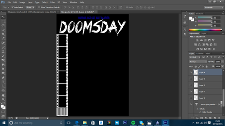
This is the starting layout of the magazine
|
|
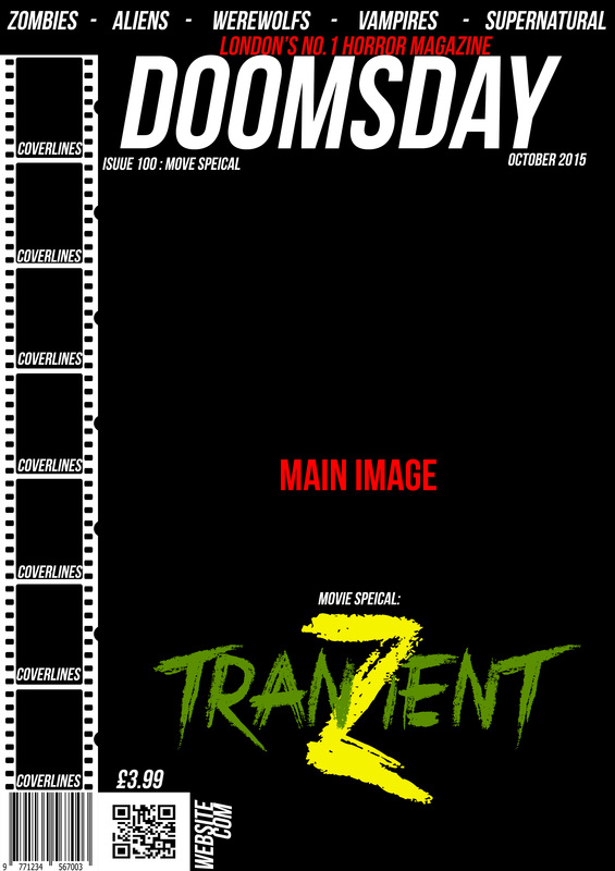
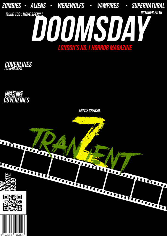
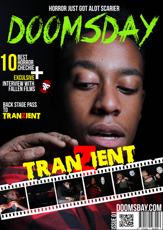
I have added the sub-heading of the magazine in a dark navy blue at the top of the page. I have also develop the masthead 'Doomsday' in the font crimes time six and I have made it white for now so it standout from the black background. I have them added a film reel with will act as coverlines in the magazine to connotes its a film special. In addition I have added the barcode.
|

|
This next stage I have developed the masthead by changing the colour to green and the subheading to white. I have also changed the idea of using the film reel as coverlines and I have slanted it and place images in them to simulate a behind the scenes. I have also added the QR code and moved the barcode and joined them to simulate a box. I have also added the website name and the price adjacent to the QR and barcode.
|

|
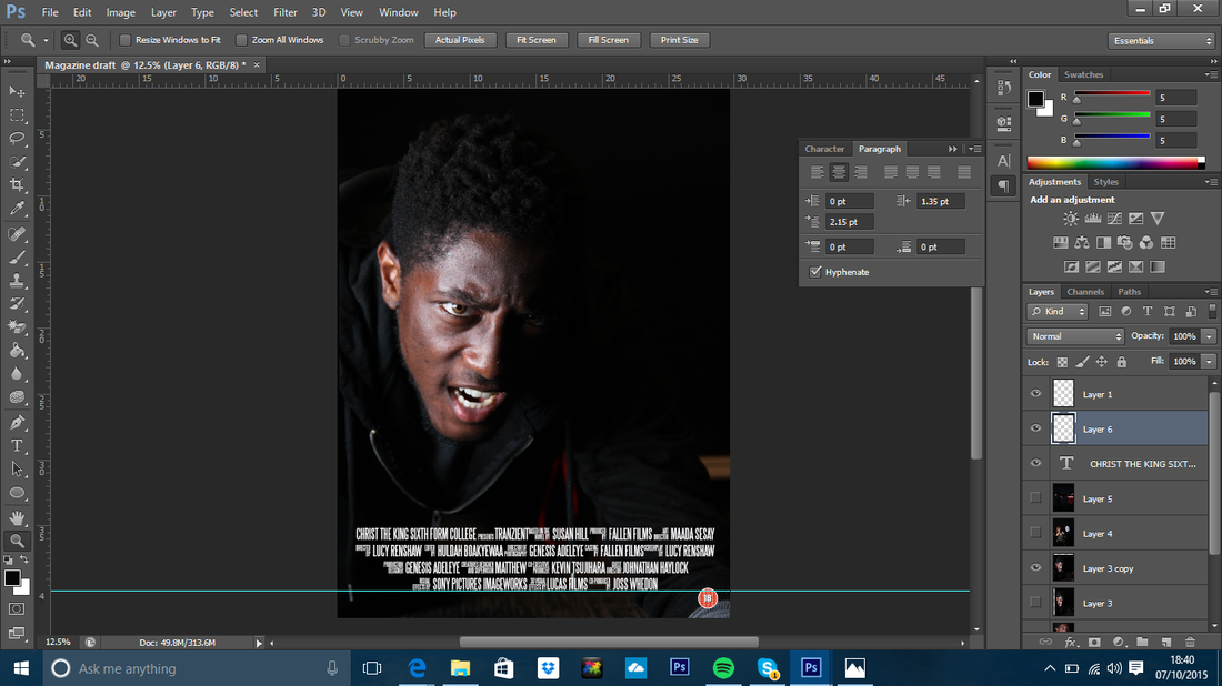
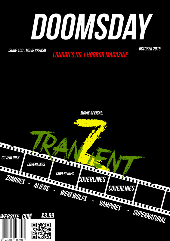
I have developed the final layout. I have done this by adding an image of the main actor. I chose it because it had the main protagonist being grabbed by a hand. This worked well so I decided to use it for the test magazine. We also added cover lines on the left third and I have also added the name of the film above the film reel.
|
Test Shots
This is some test pictures that we took as a group to give use a basic idea of what we want out photos to look like. We have used props such as eye contacts and a severed hand to emphasise that this is a zombie film as those props hold zombie connotations.


