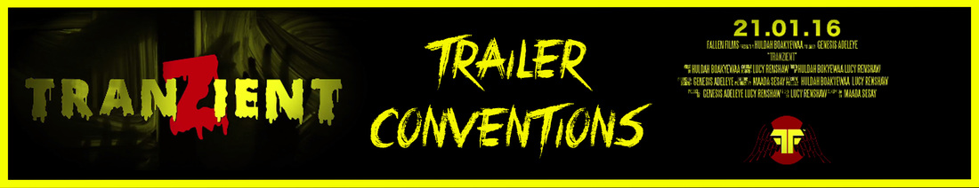
In what ways does your media production use , develop or challenge
form s & conventions of real media products?

|
Question 1 of the evaluation is asking us in what way does our final products compare to real media products in terms of the inspirations we took for existing horror content and how we either developed it or changed it in order for us to aim for the highest marks possible as well as engaging our target audience and meeting there expectations. To tackle this task effectively it is a good idea to refer back to the textual analyses, in which their is a list of conventions that possibly apply to our sub-genre. Leading on we'll be able to to make comparisons of real media text within our sub-genre against our final products.
Conventions are the familiar and predictable forms and techniques used by the media to communicate certain ideas. The rules followed can be developed and changed but have to be recognizable to their audience. Bellow are some existing real media text which feature these conventions alongside our final products in which we followed these rules which are developed and changed. |

|


|
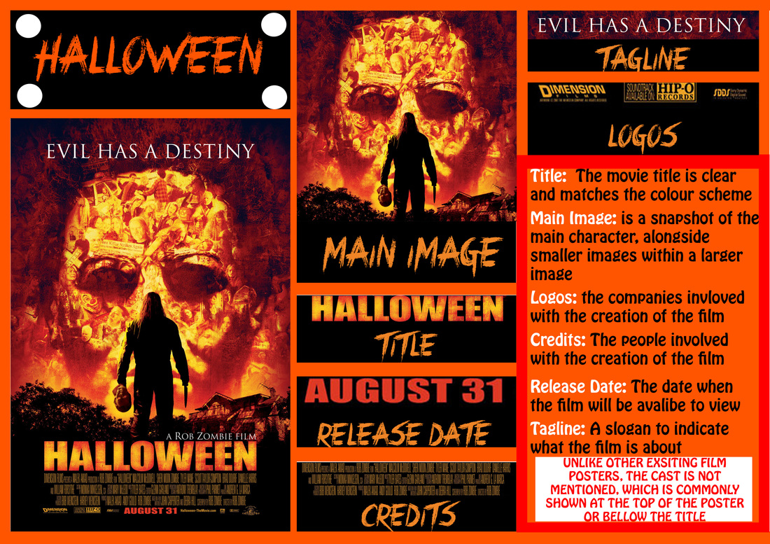
The following diagrams illustrate our research on poster conventions in which we divided into sections by dissecting different parts from existing real media text. From this research we have realized most of them were applied to our own poster, therefore this shows its importance to the viewer. Bellow you will also see our poster where we have made a diagram showing conventions we followed, developed and changed.

|

|
Used
Above shows our movie poster Tranzient divided and cut up into different elements illustrating the conventions we've used. Most of the common conventions on a poster we kept just like existing posters we researched above. In similar ways to the real media text we analysed they all feature a Large title across the poster, which we have made big and clear enough for our target audience to read. Our group decided on a effective title and colour scheme for presentation purposes as the running colour scheme on our website matches. In similar ways to the 'Halloween'' film poster we also enjoyed using brighter colours and tried to keep a minimum of black as its been commonly used. In addition to similarities we decided to add a mixture of different stills from the trailer which we tinted in grey at the bottom of our poster while the first half illustrates the main zombie in our trailer. On the 'Halloween' poster the creator uses an image from the film of the main character and the antagonists' mask floats in the background while smaller images are positioned within the bigger image. We kept the convention of mentioning the cast members as we thought it be a good idea to give credit to the principle cast just like the 'Scream' poster which we both placed under the film title.
DEVELOPED
In terms of development, our grouped developed the following conventions: our title, the main image and website. A a group we thought our title needed the most attention as it would be memorable to our target audience. We thought the more different it looks- compared to the standard simple text and bold letters as we have come to see a lot during our research of existing horror posters for example the 'Halloween' poster - then our audience would be more eager to watch the trailer. In similar ways the scream movie poster plays with the letter M where the symbol of a knife is placed in the middle which represents the weapon used by the antagonist. The return movie poster places the second R backwards which represents the meaning of the title the fact something or the antagonist has come back to taunt more victims. Where as in our poster the dripping blood symbolizes and the large letters symbolizes mass consumerism within a zombie apocalypse and the mass blood shed. Also changing the S to a Z gives viewers the hint that our sub-genre chosen is zombie as our main image doesn't give too much away. Moreover, due to the fact our sub-genre is Zombie we wanted to include the eyes of the main zombie as our main image instead of a commonly used way of portraying zombies where there chasing a group of people. Therefore we wanted to keep it engaging as possible but also simple so everything flows together. Plus most of the posters analysed placed there website in a small font on the poster but we decided to expand on this and make it as visible as possible so it shows its importance and it indicates to the viewers that they can be kept updated.
|
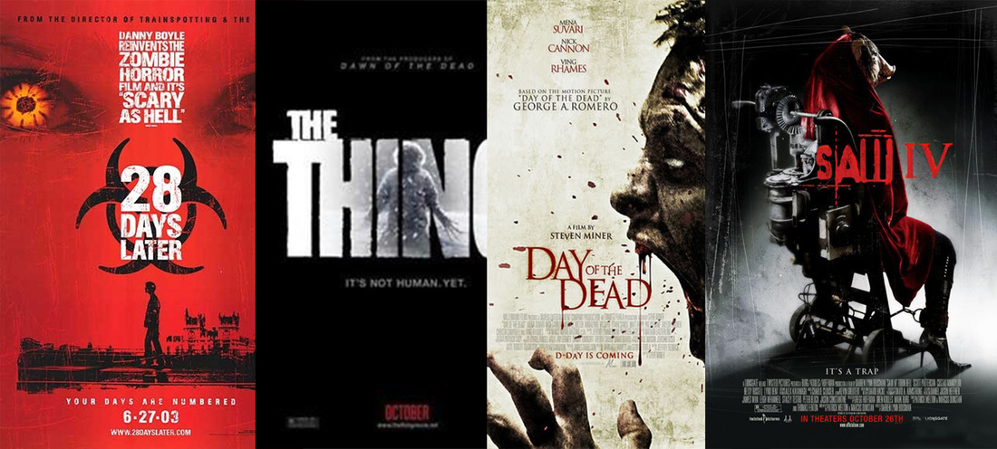
The following images show a few of the horror posters that place the title of the in middle. For this reason we decided on positioning our title in the middle as its not been commonly used and we thought that is would be best to try something different than placing the title at the bottom. Due to the fact our sub genre is zombie, '28 Days Later' became an inspirational movie during the process of making our final products. As you can see on the left, the film poster has two separate images from the movie placed together and the title in the middle with an added icon which would become memorable. In similar ways our poster follows in the same way as the letter Z became our memorabilia and links well with the concept of our trailer.
|
CHAllenged
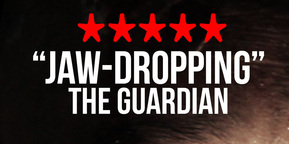
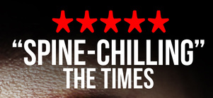
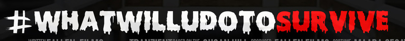
We as a group feel we haven't changed anything in relation to poster conventions but we decided to add the following: Critics Quotes and a twitter hashtag. The reason for this is to encourage our viewers to watch our final product even more especially if a well known critic or newspaper speaks of watching the trailer/film and gives it a high rating. The twitter hashtag is linked to the fact our the age rate of our target as well as our generation is constantly on social media where certain things get promoted and eventually become more talked about because its been seen by many different people. Therefore the twitter hashtag would keep our audience still in tact with the trailer so its not forgotten about and could possibly persuade another target audience to also view our products.
|
|


|


|
The following diagrams illustrate our research on magazine conventions in which we divided into sections by dissecting different parts from existing real media text. From this research we have realized most of them were applied to our own magazine, therefore this shows its importance to the viewer. Bellow you will also see our magazine where we have made a diagram showing conventions we followed, developed and changed.

|

|

|
used:
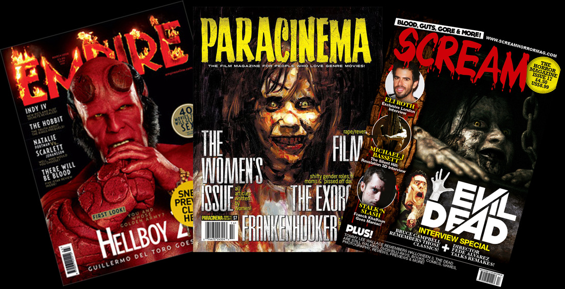
As viewed above our group researched existing horror magazines and split them into sections in terms of common magazine conventions that is followed in order to create the product. Following our search we followed the same steps but towards our own magazine in which have listed and explained our reasons for our decision. For this reason we were able to see similarities with real media text especially with the magazine' SFX Horror' which was the magazine with the most detail like ours. It had simple and short coverlines, a promotion of a film poster and a menu strip listing popular horror movies at the time of the creation. In the same way we followed its footsteps in terms of the masthead which both typography is bold and bright - clear and a reasonable size for the target audience to notice- plus the font used we kept memorable in order for the audience to remember the magazine so they can continue to buy the continuous series. This is also noticeable for the other real media text we found, illustrating that the masthead is important and its crucial to pay attention to detail as the viewer more likely to view the name of the magazine first. Comparing our main image with the 'SFX Horror' magazine, both was kept to more than one subject which makes the magazine more engaging yet making sure we get more out of the space on the page. Plus the idea of having more than one subject was our way of letting our readers know the link between our teaser trailer and poster, hence the meaning behind the main cover line 'Tranzient' which we also decided to make more visual. In comparison with the 'Scream' , 'HorrorHound' and 'Fangoria' magazine front covers, we also decided to place a barcode on the page but in a smaller size, to indicate that its not the most important feature on the page.
|
The following images on the left illustrate other existing horror magazines where the masthead typography design is unique and remains memorable on the the other issues released. The scream magazine also illustrates how the main cover line is kept more visual rather than having more text which can put viewers off from continuing to read further. For this reason we wanted to keep or magazine front cover engaging as possible. Another similar trait with the magazines is the use of the colour red, yellow, white and black which are bright colours which keeps the the page vibrant on the black background ,while the brightness and contrast are kept at a good level in order for the main image to stand out.
|
developed:

|
As our group dissected the magazine conventions , we could only find 3 features we believe that we developed which was the use of the social networking apps, deciding to put pictures under the main cover line and the film reel at the bottom of the page we listed as a visual cover line. The reasons why we placed social networking apps is because our generation overly use different social media to communicate with different people therefore for viewers to know that they can talk about the product or find more about on the a social media page, makes it more engaging and allows them to ask questions to the company. This is also a good idea to keep popularity with the product as well as possibly gaining a bigger audience. Our decision to use more photos linking to the cover lines was our way to entice the viewer to flick through the magazine if they found a noticeable person from the image and would read the article on them. In a similar way the 'Scream' and 'HorrorHound' magazine front covers have used the same technique.
|
challenged:
As a group we felt that we hadn't changed anything in terms of the conventions but we felt like we followed more because changing it too much would become to confusing for our viewers. We developed it more in order for magazine to differ from the existing horror magazines we researched and to keep it unique.
|
|
|
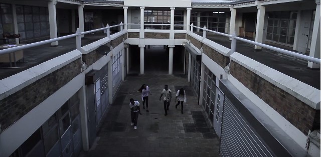
Are trailer comparison is Resident Evil: Afterlife' due to the fact their are similar elements that match our trailer. Therefore we have noted down the following elements that applied in both trailers. Firstly , resident evil has a animated starting clip of the production company following two establishing shots of the scenery. In comparison to our trailer we have 2 establishing shots and our animated logo following after a cross cut between a scene with dialogue.
Resident evil Trailer
The following are 2 screenshots of establishing shots in the resident evil trailer


|
tranzient trailer
The following are 2 screenshots of establishing shots in our trailer 'Traznient'


|
Extreme close ups of faces were used in the 'Resident Evil' trailer and our 'Tranzient' trailer. We liked the idea of this shot because it illustrates to the view who's the most important character within in the trailer plus its a good way to see the features of certain characters as they will become memorable.

|

|
We have also include close ups of characters in the dark to illustrate that their identity is not ready to be shown and will be later revealed. Our footage was tinted in red to symbolize danger while the resident evil footage remains a dark black or blue;

|

|
Wide angle shots of characters

|

|


|
Captions From; Resident Evil Trailer


|


|

|
|
Captions From; Tranzient Trailer
|
|

|

|

|

|

|
editing
Montage editing - a series of short shots are edited into a sequence to condense space, time, and information. for the following trailers the montage scene happens mid way to the end (resident evil - 0.51 and Tranzient 1.01) The shots are quick paced filled with action packed scenes from running to the antagonist closing in on the principle cast.
|
|
|
used:
In the beginning we followed the idea of adding a few shots of the scenery as we felt it was best to give the viewers an idea of important locations as well as to make sure the trailer is easy to understand. In comparison we also followed the idea of using extreme close ups and scenes in the dark due to the fact its gives the viewers an idea of the main character/s, plus scenes in the dark illustrate to the viewer that the characters within the scenes identity are kept hidden for a reason and they will eventually become noticeable later within the trailer. We also followed the same idea of giving the views less captions to read and more motion to watch as it is best and important to keep the audiences engaged the whole time plus, too many captions can give away the story line to quick, so simple one worded or shot sentenced captions makes the viewers more eager to find out more.
developed
In terms of development, we believe we mostly developed: the styling of the captions, due to the fact we added a shimmer/light which hovers in different directions over the the captions to give the sense of the movement of a red alarm. This is also links to the development of the colouring of our footage where our views can notice the red tint which symbolizes blood and danger - warning signs- which we felt best to highlight as our sub-genre is zombie which has a lot of blood shed. Also the movement of our captions panning left and right and zooming towards the screen illustrates tension is gradually building up and more fast paced scenes are about to appear.
challenged
As a group we felt there was not much that had been changed in terms of trailer conventions but we changed the length of the on screen credits and kept it to one scene as our trailer is a minute and 30 seconds, hence the reason why the resident evil trailer which is two minutes and three seconds as the editor decided to dedicate three scenes of credits.
our chosen sub-genre was zombie

costume:
In order for our cast to look like zombies, we had to research costumes that zombies wear which we then applied when we creating our own costumes. We looked on the search engine google and found a range of images, as well as watching well known zombie films:

|
|

|
In terms of inspiration. we felt the TV series 'The Walking Dead' and the famous 'Dawn of the Dead' film made by George A Romero linked perfectly to our synopsis as we made our antagonists as realistic as possible as well as making sure it reflected what a modern day zombie would look like. Therefore we went with the idea of clothing which teenagers would wear today which the images surrounding this text box illustrates. Also for our main zombie who's image is on the left we included the idea of giving the zombies eyes a yellow/honey colour instead of the common used colour green.
|


|
Make-up
In terms of make-up our research was mainly using YouTube watching make-up tutorials which our group practiced before shooting. We also used the search engine Google to get basic pictures of how zombies look in existing shows and films:
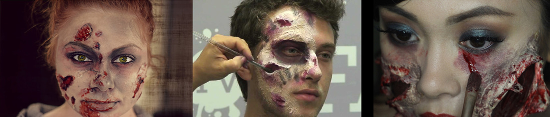
The following are Make-up tutorials which we watched in order to create our antagonists;
|
|
|
|
The following images and video (our own tutorial) are of the the make-up being practiced;
|
|

|

|
Props
From looking at existing real media linking to our sub-genre, not many props were used unless it was a weapon used by the protagonists fighting off the zombies.
However we were able to include a scene where a weapon is used in our trailer - a wrench- which the Hero found in an abandoned room and used as a defense. Also the wireless radio which we used to link to our scene where the principle cast is listening to a news report on the outbreak. We were also able to find an existing zombie trailer which also used props:
However we were able to include a scene where a weapon is used in our trailer - a wrench- which the Hero found in an abandoned room and used as a defense. Also the wireless radio which we used to link to our scene where the principle cast is listening to a news report on the outbreak. We were also able to find an existing zombie trailer which also used props:

|
|
characters
In the majority of popular zombie films the victims are always being chased by a group of zombies who have been infected by a disease, which can also spread if you have been bitten by someone who has been infected. But in terms of how they move, their is a variety of different ways starting from a group who crawl, walk slow or just run wildly at the victims. In our trailer we stuck with the basic walk at the beginning and eventually the zombies' pace sped up:
|
starting from the time of 0:29 you can see the slow movement of the zombies
Snapshot of the slow movement of zombies
|
starting at the time of 0:45 to 0:50 illustrates fast movement of the zombies
Snapshot of the zombies rapidly crowding around the victim

|
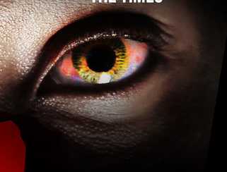
In terms of character appearance the followed the common convention of the different eye colour for our main zombie, as well as kept with the idea of torn and tattered clothing which symbolizes how animalistic zombies can be

Ollie's eyes on the magazine which we raised the brightness so it would stand out the most
|

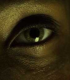
Snapshot 1# : Ollie's eye shown at the end of the trailer which we placed in yellow tint
|

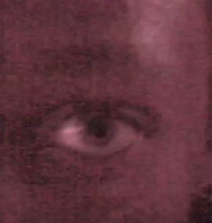
Snapshot 2# - Ollie's eye featured in the montage scene which we placed in red tint
|
As shown above we followed the idea of zombies eyes changing colour as well as developing the colour to yellow instead of the common red, green and icey blue due to the fact we wanted to highlight that our them colour was yellow
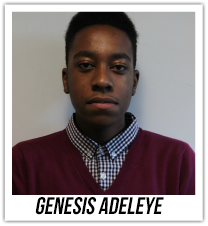
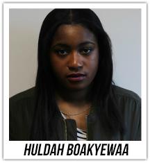
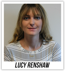
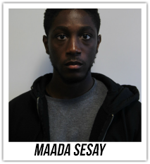
Principle characters/protagonits
We had four main characters who are also our protagonists throughout the trailer whereas in most zombie films it starts off with a big group of victims which eventually deteriorates as the virus spreads quick. Bellow is the follow individual photos our group took while creating the shooting script:
|
|
|
|
In the film resident evil, they used the concept of a female being the final girl where as we stuck to the commonly followed idea of the male being the hero/leader - as in the films 28 days later and Shaun of the Dead- which in our trailer was genesis known as Nile is the smart guy out of all the rest of the characters. Bellow will illustrates snapshots from our trailer where we have highlighted his importance:
|
The following image is a scene in the trailer which the principle cast listen to a broadcast but an extreme close up genesis appears to illustrate his importance at the beginning

|
The following image shows genesis holding a tool as he slowly backs up towards a wall as the zombies have cornered him in which the wrench is used as his defense

|
The following image is a scene where the characters discuss a plan which genesis' character finally illustrates his ability to be a leader and help the group survive

|
The following trailers above illustrate various scenes where the same male appears which the audience can identify as the male lead in the film
length
During the period we were researching existing horror films within different sub-genres, our group had realised that the length of the majority of them were a minute and 30 seconds or just under. Therefore we decided to follow this because it was a good length to place all our shots which gives our viewers more to watch and understand what our synopsis is and try to find what we haven't let viewers know as we didn't want to give to much away.
|
|
Music
The following trailers bellow features some of the following sounds we used: Drones, thuds, wind, action theme music, screams , alarms and zombie sounds:
|
|
|
|
|
Bellow are examples of sounds that we used in our trailer, which we spent time editing to make sure each sound flowed well with each scene as well as all together
|
|
| ||||||
|
The sounds which can be listened to above effectively makes a viewers jumper and keeps them engage through out the whole trailer. The use of the wind during the beginning of our trailer was to illustrate sounds surrounding the principle cast while they sat outside listening to broadcast. While the use of the drone throughout was our intention to keep the whole atmosphere eerie as possible. An the action sounds, zombie groans and alarm sound was to illustrate to the viewers the tension during a zombie apocalypse

|

The following image on the left shows different types of folders in one file caller 'Horror sounds' which we were able to access on the Mac's in college. It featured a range of different sounds from chains to ambient sounds as well as the sounds we have placed in our own trailer. The sounds were downloaded from a website called 'Free Sound' where many people upload recorded sounds or sounds they have created from using software like garage band.
|

Evaluation
To conclude, as a group we feel that we have understood the importance of conventions of real media text, due to the fact we were able to complete a poster, magazine and trailer by the deadline and received good reviews after our target audience viewed our products. Also by developing these conventions we were able to show off something different yet still keeping it engaging for our audience. Challenging conventions meant we were able to change the way the original form of the conventions which illustrates that we were thinking outside the box and we felt it was good for our audience to see our creativity.
